


植物大战僵尸游戏相信大家都玩过吧,那么具体实现代码大家知道吗,下面小编给大家分享代码,在没分享代码之前先给大家展示下效果图:
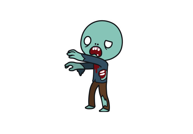
css代码:
复制代码代码如下:
@charset "utf-8";
*{
padding:0px;
margin:0px;
}
body,html {
width:100%;
height:100%;
margin:0px;
padding:0px;
font-family: "Roboto", sans-serif;
font-size: 12px;
font-weight: 700;
}
body{
position:relative;
background: transparent url("../img/background.jpg") no-repeat scroll center top / cover;
background-attachment:fixed;
}
.zoombie {
width: 200px;
height: 312px;
background-image: url("../img/walkingdead.png");
-webkit-animation: play 1.8s steps(10) infinite;
-moz-animation: play 1.8s steps(10) infinite;
-ms-animation: play 1.8s steps(10) infinite;
-o-animation: play 1.8s steps(10) infinite;
animation: play 1.8s steps(10) infinite ;
}
@-webkit-keyframes play {
from { background-position: 0px; }
to { background-position: -2000px; }
}
@-moz-keyframes play {
from { background-position: 0px; }
to { background-position: -2000px; }
}
@-ms-keyframes play {
from { background-position: 0px; }
to { background-position: -2000px; }
}
@-o-keyframes play {
from { background-position: 0px; }
to { background-position: -2000px; }
}
@keyframes play {
from { background-position: 0px; }
to { background-position: -2000px; }
}
#wrapper {
transform: translate(-50%, -50%);
position: absolute;
top: 50%;
left: 50%;
}
以上所述是小编给大家分享的CSS3+Sprite实现僵尸行走动画特效源码 ,希望对大家有所帮助。



