


下面以2017年新年祝福语为例给大家展示下效果。
纯CSS3实现的鼠标悬停时边框旋转的效果:
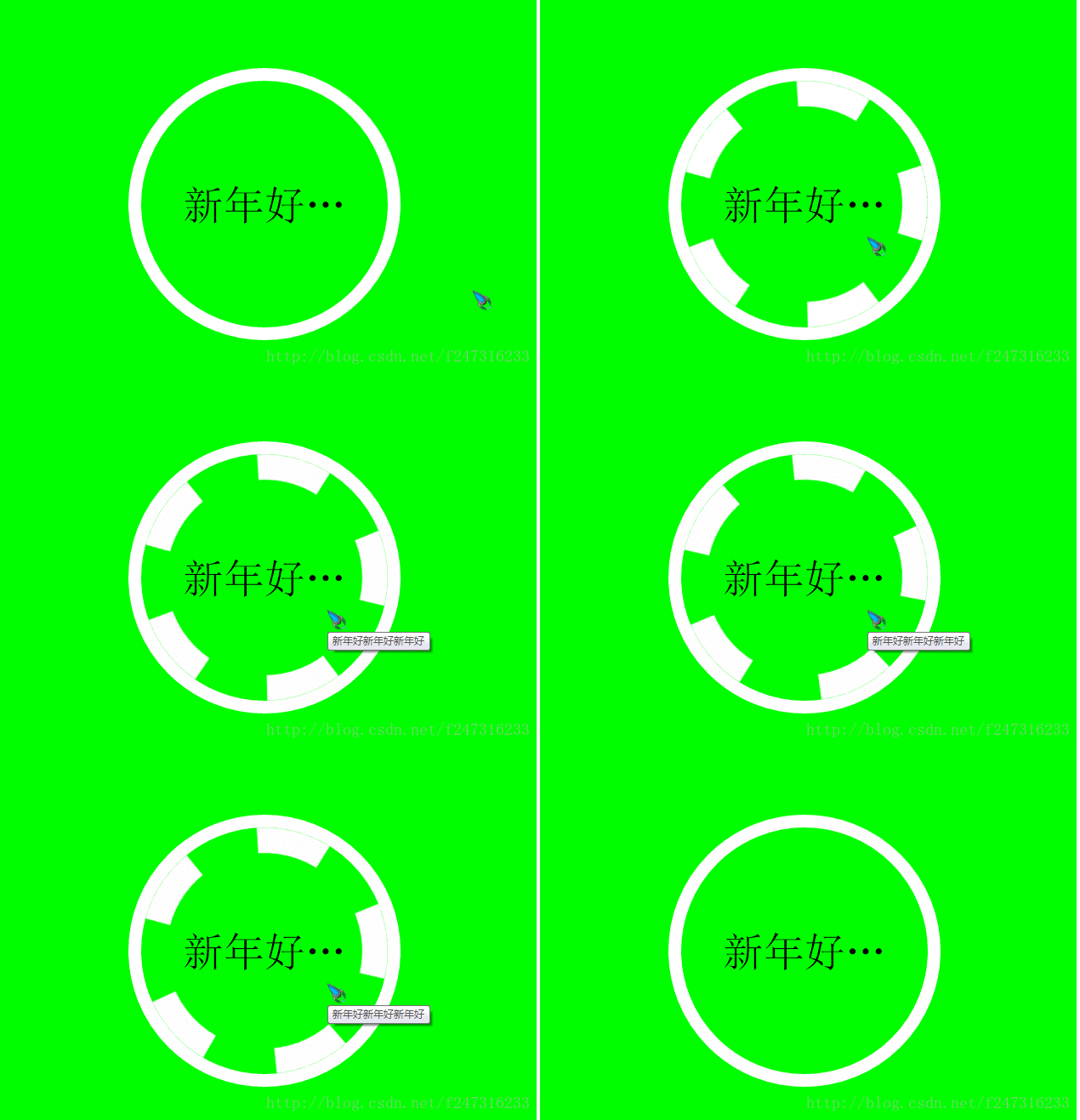
实现代码如下,代码中注释已经比较详细,就不再多说了:
    document

 body {
     width: 40rem;
     height: 30rem;
     font-size: 62.50%;
 }
 .container {
     width: 100%;
     height: 100%;
     background: #0f0;
     text-align: center;
 }


 .content {
     display: inline-block;
     margin-top: 5rem;
     width: 20rem;
     height: 20rem;
     border: solid 15px rgba(255, 255, 255, 1);
     border-radius: 50%;
     box-sizing: border-box;
     transition: all 2s;
 }


 .content:before {
     display: inline-block;
     width: 100%;
     height: 100%;
     border-radius: 50%;
     box-sizing: border-box;
     content: '';
 }

 .content:hover {

 }

 .content:hover:before {
     border: dashed 30px #fff;
     animation: whirl 9s linear infinite;
 }

 .con-text {
     margin: -60% auto;
     width: 80%;
     font-size: 3rem;

     overflow: hidden;
     white-space: nowrap;
     text-overflow: ellipsis;
 }

 @keyframes whirl {
     from {
  transform: rotate(0deg);
     }
     to {
  transform: rotate(360deg);
     }
 }


     新年好新年好新年好
以上所述是小编给大家介绍的纯CSS3制作的鼠标悬停时边框旋转,希望对大家有所帮助,如果大家有任何疑问请给我留言,小编会及时回复大家的。在此也非常感谢大家对考高分网网站的支持!



