


首先来看看实现的效果图(静态):
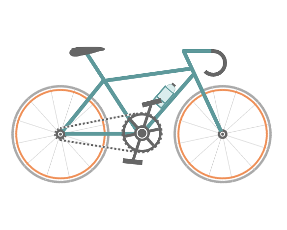
实例源码:
  自行车

   * {
    margin: 0;
    padding: 0
   }

   ol,
   ul {
    list-style: none
   }

   .cycle-outer {
    width: 534px;
    height: 260px;
    position: absolute;

    top: 50%;

    margin: -160px 0 0 -267px;

    left: 50%;
   }

   .cycle-wrapper {
    width: 534px;
    height: 260px;
    margin: 0 auto;
    position: relative;

   }

   .cycle-wheel-front {

    margin: 100px 0 0 330px;
   }

   .cycle-wheel-back {

    margin: 100px 0 0 0px;
   }

   .cycle-wheel-outer {
    background: transparent;
    border: 5px solid #aaa;
    border-radius: 50%;

    width: 190px;
    height: 190px;
    position: absolute;
    margin-top: 5px;
    animation: wheel-rotate 2s linear infinite;

   }

   @keyframes wheel-rotate {
    from {
     transform: rotate(0deg);
    }
    to {
     transform: rotate(360deg);
    }
   }

   .cycle-wheel-outer:after {

    background: transparent;
    border: 4px solid #EF9058;
    border-radius: 50%;
    width: 176px;
    height: 176px;
    position: absolute;
    margin: 3px;
    content: "";
   }

   .spoke {

    position: absolute;
    width: 1px;
    height: 200px;
    background: #ccc;
    margin: -5px 0 0 95px;
    z-index: 0;
   }

   .spoke:after {

    content: "";
    position: absolute;
    width: 1px;
    height: 200px;
    background: #ccc;
    transform: rotate(120deg);
   }

   .spoke:before {

    content: "";
    position: absolute;
    width: 1px;
    height: 200px;
    background: #ccc;
    transform: rotate(240deg);
   }


   .spoke-container li:nth-child(2) {

    transform: rotate(30deg);
   }

   .inner-disc {

    background: #666;
    width: 20px;
    height: 20px;
    border-radius: 50%;
    position: absolute;
    left: 50%;
    margin: -10px 0 0 -10px;
    top: 50%;
   }


   .inner-disc-2 {

    background: transparent;
    width: 6px;
    height: 6px;
    border: 2px solid #FFF;
    border-radius: 50%;
    position: absolute;
    left: 50%;
    margin: -5px 0 0 -5px;
    top: 50%;
   }

   .cycle-wheel-back .inner-disc-2:after {

    content: "";
    background: transparent;
    width: 18px;
    height: 18px;
    border-radius: 50%;
    position: absolute;
    left: 50%;
    margin: -13px 0 0 -13px;
    top: 50%;
    border: 4px dotted #666;
   }
   .cycle-body {
    margin-left: 125px;
   }
   .front-wheel-frame {
    background: #5E999B;
    width: 8px;
    height: 180px;
    position: absolute;
    z-index: 2;
    transform: rotate(-25deg);
    margin: -72px 0 0 260px;
   }
   .top-frame {
    background: #5E999B;
    width: 180px;
    height: 8px;
    position: absolute;
    z-index: 2;
    margin: -20px 0 0 62px;
    transform: rotate(-8deg);
   }
   .front-frame {
    background: #5E999B;
    width: 8px;
    height: 160px;
    position: absolute;
    z-index: 2;
    transform: rotate(41deg);
    margin: -36px 0 0 189px;
   }
   .center-frame {
    background: #5E999B;
    width: 8px;
    height: 205px;
    position: absolute;
    z-index: 2;
    transform: rotate(-33deg);
    margin: -84px 0 0 75px;
   }
   .back-frame {
    background: #5E999B;
    width: 8px;
    height: 136px;
    position: absolute;
    z-index: 2;
    transform: rotate(39deg);
    margin: -23px 0 0 19px;
   }
   .bottom-frame {
    background: #5E999B;
    width: 159px;
    height: 8px;
    position: absolute;
    z-index: 2;
    margin: 100px 0 0 -16px;
   }
   .handlebar-front {
    width: 60px;
    height: 8px;
    background: #5E999B;
    z-index: 2;
    position: absolute;
    margin: -68px 0 0 222px;
    border-top-left-radius: 3px;
    border-bottom-left-radius: 3px;
   }
   .handlebar-curve {
    width: 40px;
    height: 40px;
    border: 8px solid #666;
    border-top-right-radius: 100%;
    border-bottom-right-radius: 100%;
    border-bottom-left-radius: 100%;
    background: transparent;
    position: absolute;
    margin: -68px 0 0 258px;
    border-left: 8px solid transparent;
    border-top: 8px solid #666;
    border-bottom: 8px solid #666;
   }

   .seat {
    width: 50px;
    height: 10px;
    background: #666;
    border-radius: 44%;
    position: absolute;
    margin: -73px 0 0 15px;
   }

   .seat:after {
    width: 0px;
    height: 0px;
    border-style: solid;
    border-width: 0 40px 16px 40px;
    border-color: transparent transparent #666 transparent;
    content: "";
    position: absolute;
    z-index: 3;
    transform: rotate(-12deg);
    position: absolute;
    border-radius: 100%;
    margin: 0 0 0 -26px;
   }
   .seat:before {
    width: 0px;
    height: 0px;
    border-style: solid;
    border-width: 0 40px 16px 40px;
    border-color: transparent transparent #666 transparent;
    content: "";
    position: absolute;
    z-index: 3;
    transform: rotate(179deg);
    position: absolute;
    border-radius: 100%;
    margin: 0 0 0 -26px;
   }
   .seat span {
    width: 32px;
    height: 19px;
    background: #666;
    border-radius: 100%;
    position: absolute;
    margin: 1px 0 0 -22px;
    transform: rotate(-11deg);
   }

   .chain-rotation {
    position: absolute;
    z-index: 16;
   }

   .chain-disc-inner {
    background: #666;
    width: 18px;
    height: 18px;
    border-radius: 50%;
    position: absolute;
    margin: 2px;
    z-index: 4;
   }
   .chain-disc-outer {
    background: #FFF;
    width: 22px;
    height: 22px;
    border: 5px solid #666;
    border-radius: 50%;
    position: absolute;
    margin: 87px 0 0 250px;
    z-index: 3;
    content: "";
   }

   .chain-rods {
    height: 70px;
    width: 6px;
    background: #666;
    position: absolute;
    margin: 67px 0 0 263px;
    z-index: 15;
    animation: wheel-rotate 2s linear infinite;
   }
   .chain-rods:before {
    content: "";
    height: 70px;
    width: 6px;
    background: #666;
    position: absolute;
    transform: rotate(120deg);
   }
   .chain-rods:after {
    content: "";
    height: 70px;
    width: 6px;
    background: #666;
    position: absolute;
    transform: rotate(240deg);
    -webkit-transform: rotate(240deg);
    -moz-transform: rotate(240deg);
   }
   .outer-axle {
    height: 70px;
    width: 70px;
    border-radius: 50%;
    background: transparent;
    border: 5px solid #666;
    position: absolute;
    margin: 62px 0 0 226px;
    z-index: 3;
   }

   .outer-axle:after {
    content: "";
    height: 74px;
    width: 74px;
    border-radius: 50%;
    background: transparent;
    border: 5px dotted #666;
    margin: -7px;
    position: absolute;
    z-index: 3;
    animation: wheel-rotate 2s linear infinite;
   }

   .chain-up {
    background-color: transparent;
    background-size: 8px 2px;
    background-position: 0 0, 30px 30px;
    width: 155px;
    height: 4px;
    position: absolute;
    z-index: 9;
    background: #EEE;
    transform: rotate(-11deg);
    margin: 76px 0 0 98px;
   }
   .chain-up:before {
    content: "";
    background-color: transparent;
    background-image: linear-gradient(90deg, #666 25%, transparent 25%, transparent 75%, #666 75%, #666);
    background-size: 8px 2px;
    background-position: 0 0, 30px 30px;
    width: 155px;
    height: 4px;
    animation: chainUp 2s linear infinite;
    position: absolute;
    z-index: 10;
   }
   .chain-bottom {
    background-color: transparent;
    background-size: 8px 2px;
    background-position: 0 0, 30px 30px;
    width: 155px;
    height: 4px;
    position: absolute;
    z-index: 9;
    background: #EEE;
    -webkit-transform: rotate(9deg);
    -moz-transform: rotate(9deg);
    transform: rotate(9deg);
    margin: 127px 0 0 98px;
   }

   .chain-bottom:before {
    content: "";
    background-color: transparent;
    background-image: linear-gradient(90deg, #666 25%, transparent 25%, transparent 75%, #666 75%, #666);
    background-size: 8px 2px;
    background-position: 0 0, 30px 30px;
    width: 155px;
    height: 4px;
    animation: chainDown 2s linear infinite;
    position: absolute;
    z-index: 10;
   }

   .pedal-rod {
    height: 120px;
    width: 6px;
    background: #666;
    position: absolute;
    margin: -25px 0 0 0px;
   }

   .pedal-rod:before {
    width: 40px;
    height: 10px;
    background: #666;
    position: absolute;
    margin: 10px;
    content: "";
    margin: -7px -17px;
    animation: pedal1 2s linear infinite;
   }

   .pedal-rod:after {
    width: 40px;
    height: 10px;
    background: #666;
    position: absolute;
    margin: 10px;
    content: "";
    margin: 119px -17px;
    animation: pedal2 2s linear infinite;
   }

   .bottle-holder {
    width: 20px;
    height: 36px;
    background: #daeded;
    border: 3px solid #5E999B;
    position: absolute;
    margin: 54px 0 0 -25px;
   }

   .bottle-holder:after {
    width: 20px;
    height: 3px;
    content: "";
    background: #5E999B;
    position: absolute;
    margin: 24px 0 0 0px;
   }

   .bottle-holder:before {
    background-color: #daeded;
    width: 18px;
    height: 10px;
    border-radius: 30% / 100%;
    border-bottom-left-radius: 0;
    border-bottom-right-radius: 0;
    content: "";
    position: absolute;
    margin-top: -13px;
    border: 1px solid #98baba;
    border-bottom: 0;
   }
   .bottle-holder span {
    position: absolute;
    width: 9px;
    height: 4px;
    background: #666;
    margin: -17px 0 0 5px;
   }

   @keyframes chainUp {
    0% {
     background-position: 0 25%;
    }
    100% {
     background-position: 100% 0;
    }
   }
   @keyframes chainDown {
    0% {
     background-position: 100% 0;
    }
    100% {
     background-position: 0 25%;
    }
   }

   @keyframes pedal1 {
    0% {
     transform: rotate(00deg);
    }
    25% {
     transform: rotate(-140deg);
    }
    50% {
     transform: rotate(-180deg);
    }
    75% {
     transform: rotate(-240deg);
    }
    100% {
     transform: rotate(-360deg);
    }
   }
   @keyframes pedal2 {
    0% {
     transform: rotate(00deg);
    }
    25% {
     transform: rotate(-60deg);
    }
    50% {
     transform: rotate(-180deg);
    }
    75% {
     transform: rotate(-340deg);
    }
    100% {
     transform: rotate(-360deg);
    }
   }
总结
以上就是这篇文章的全部内容了,希望本文的内容对大家的学习或者工作能带来一定的帮助,如果有疑问大家可以交流。



