


下面是实现代码:
复制代码代码如下:
p#socialicons img{
-moz-transition: all 0.8s ease-in-out;
-webkit-transition: all 0.8s ease-in-out;
-o-transition: all 0.8s ease-in-out;
-ms-transition: all 0.8s ease-in-out;
transition: all 0.8s ease-in-out;
}
p#socialicons img:hover{
-moz-transform: rotate(360deg);
-webkit-transform: rotate(360deg);
-o-transform: rotate(360deg);
-ms-transform: rotate(360deg);
transform: rotate(360deg);
}
p#socialicons2 img{
-moz-transition: all 0.2s ease-in-out;
-webkit-transition: all 0.2s ease-in-out;
-o-transition: all 0.2s ease-in-out;
-ms-transition: all 0.2s ease-in-out;
transition: all 0.2s ease-in-out;
}
p#socialicons2 img:hover{
-moz-transform: rotate(70deg);
-webkit-transform: rotate(70deg);
-o-transform: rotate(70deg);
-ms-transform: rotate(70deg);
transform: rotate(70deg);
}
p#socialicons3 img{
}
p#socialicons3 img:hover{
-moz-transition: all 0.5s ease-in-out;
-webkit-transition: all 0.5s ease-in-out;
-o-transition: all 0.5s ease-in-out;
-ms-transition: all 0.5s ease-in-out;
transition: all 0.5s ease-in-out;
-moz-transform: rotate(-360deg);
-webkit-transform: rotate(-360deg);
-o-transform: rotate(-360deg);
-ms-transform: rotate(-360deg);
transform: rotate(-360deg);
}
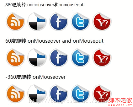
360度旋转 onmouseover和onmouseout
下面是实现代码:
复制代码代码如下:
p#socialicons img{
-moz-transition: all 0.8s ease-in-out;
-webkit-transition: all 0.8s ease-in-out;
-o-transition: all 0.8s ease-in-out;
-ms-transition: all 0.8s ease-in-out;
transition: all 0.8s ease-in-out;
}
p#socialicons img:hover{
-moz-transform: rotate(360deg);
-webkit-transform: rotate(360deg);
-o-transform: rotate(360deg);
-ms-transform: rotate(360deg);
transform: rotate(360deg);
}
p#socialicons2 img{
-moz-transition: all 0.2s ease-in-out;
-webkit-transition: all 0.2s ease-in-out;
-o-transition: all 0.2s ease-in-out;
-ms-transition: all 0.2s ease-in-out;
transition: all 0.2s ease-in-out;
}
p#socialicons2 img:hover{
-moz-transform: rotate(70deg);
-webkit-transform: rotate(70deg);
-o-transform: rotate(70deg);
-ms-transform: rotate(70deg);
transform: rotate(70deg);
}
p#socialicons3 img{
}
p#socialicons3 img:hover{
-moz-transition: all 0.5s ease-in-out;
-webkit-transition: all 0.5s ease-in-out;
-o-transition: all 0.5s ease-in-out;
-ms-transition: all 0.5s ease-in-out;
transition: all 0.5s ease-in-out;
-moz-transform: rotate(-360deg);
-webkit-transform: rotate(-360deg);
-o-transform: rotate(-360deg);
-ms-transform: rotate(-360deg);
transform: rotate(-360deg);
}
360度旋转 onmouseover和onmouseout


60度旋转 onMouseover and onMouseout
-360度旋转 onMouseover



