


使用纯CSS,你只需要很少的代码就可以创作出各种浏览器都兼容的三角形箭头!
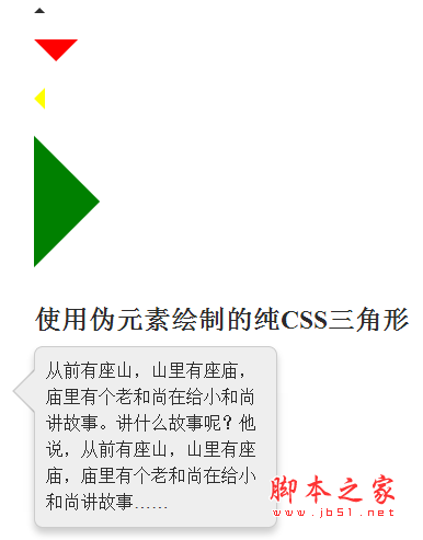
CSS代码
复制代码代码如下:
div.arrow-up {
width: 0;
height: 0;
border-left: 5px solid transparent;
border-right: 5px solid transparent;
border-bottom: 5px solid #2f2f2f;
font-size: 0;
line-height: 0;
}
div.arrow-down {
width: 0;
height: 0;
border-left: 5px solid transparent;
border-right: 5px solid transparent;
border-top: 5px solid #2f2f2f;
font-size: 0;
line-height: 0;
}
div.arrow-left {
width: 0;
height: 0;
border-bottom: 5px solid transparent;
border-top: 5px solid transparent;
border-right: 5px solid #2f2f2f;
font-size: 0;
line-height: 0;
}
div.arrow-right {
width: 0;
height: 0;
border-bottom: 5px solid transparent;
border-top: 5px solid transparent;
border-left: 5px solid #2f2f2f;
font-size: 0;
line-height: 0;
}
绘制这些三角形的关键在于,你要让箭头所指方向的两个侧边有很粗的边框。而背向箭头方向的一边也是同样粗的边框,而这条边的颜色就是你的三角形的颜色。边框越粗,三角形越大。用这种方法你可以绘制出各种颜色、各种大小、各种朝向的箭头。最妙的是,你只需要几行CSS代码就能实现这种效果。
使用:before和:after绘制CSS三角形
上面的CSS例子使用的是真正的页面元素进行绘制,但有时候这个真正的元素还有它用,你不能走上面直接进行操作,这是怎么办?纯CSS的三角形其实还可以使用伪元素(pseudo-element)进行绘制。下面就是绘制方法:
复制代码代码如下:
div.tooltip {
}
div.tooltip:before, div.tooltip:after {
content: ' ';
height: 0;
position: absolute;
width: 0;
border: 10px solid transparent;
}
div.tooltip:before {
border-bottom-color: #fff;
position: absolute;
top: -19px;
left: 255px;
z-index: 2;
}
div.tooltip:after {
border-bottom-color: #333;
position: absolute;
top: -24px;
left: 255px;
z-index: 1;
}
背向箭头的那一侧的边框的颜色就是三角形箭头的颜色。画这个箭头并不需要同时使用:before和:after两个伪元素——一个就够了。而另外一个,你可以把它用作前一个的背景阴影或背景边。
真应该早点知道这种技术!我相信在将来做界面改进时这种简洁省事的技术将派上大用途。



