


今天给大家介绍一款仿ios7的switches开关按钮。这款按钮也是纯css实现的。无需引js代码。在实现中给出了两种颜色,三种不同大小的demo。一起看下效果图:
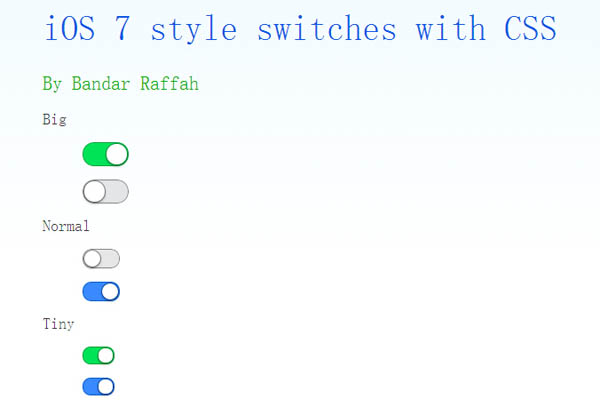
实现的代码。
html代码:
复制代码代码如下:
iOS 7 style switches with CSS
By Bandar Raffah
css代码:
复制代码代码如下:input[type="checkbox"]
{
position: absolute;
opacity: 0;
}
input[type="checkbox"].ios-switch + div
{
vertical-align: middle;
width: 40px;
height: 20px;
border: 1px solid rgba(0,0,0,.4);
border-radius: 999px;
background-color: rgba(0, 0, 0, 0.1);
-webkit-transition-duration: .4s;
-webkit-transition-property: background-color, box-shadow;
box-shadow: inset 0 0 0 0px rgba(0,0,0,0.4);
margin: 15px 1.2em 15px 2.5em;
}
input[type="checkbox"].ios-switch:checked + div
{
width: 40px;
background-position: 0 0;
background-color: #3b89ec;
border: 1px solid #0e62cd;
box-shadow: inset 0 0 0 10px rgba(59,137,259,1);
}
input[type="checkbox"].tinyswitch.ios-switch + div
{
width: 34px;
height: 18px;
}
input[type="checkbox"].bigswitch.ios-switch + div
{
width: 50px;
height: 25px;
}
input[type="checkbox"].green.ios-switch:checked + div
{
background-color: #00e359;
border: 1px solid rgba(0, 162, 63,1);
box-shadow: inset 0 0 0 10px rgba(0,227,89,1);
}
input[type="checkbox"].ios-switch + div > div
{
float: left;
width: 18px;
height: 18px;
border-radius: inherit;
background: #ffffff;
-webkit-transition-timing-function: cubic-bezier(.54,1.85,.5,1);
-webkit-transition-duration: 0.4s;
-webkit-transition-property: transform, background-color, box-shadow;
-moz-transition-timing-function: cubic-bezier(.54,1.85,.5,1);
-moz-transition-duration: 0.4s;
-moz-transition-property: transform, background-color;
box-shadow: 0px 2px 5px rgba(0, 0, 0, 0.3), 0px 0px 0 1px rgba(0, 0, 0, 0.4);
pointer-events: none;
margin-top: 1px;
margin-left: 1px;
}
input[type="checkbox"].ios-switch:checked + div > div
{
-webkit-transform: translate3d(20px, 0, 0);
-moz-transform: translate3d(20px, 0, 0);
background-color: #ffffff;
box-shadow: 0px 2px 5px rgba(0, 0, 0, 0.3), 0px 0px 0 1px rgba(8, 80, 172,1);
}
input[type="checkbox"].tinyswitch.ios-switch + div > div
{
width: 16px;
height: 16px;
margin-top: 1px;
}
input[type="checkbox"].tinyswitch.ios-switch:checked + div > div
{
-webkit-transform: translate3d(16px, 0, 0);
-moz-transform: translate3d(16px, 0, 0);
box-shadow: 0px 2px 5px rgba(0, 0, 0, 0.3), 0px 0px 0 1px rgba(8, 80, 172,1);
}
input[type="checkbox"].bigswitch.ios-switch + div > div
{
width: 23px;
height: 23px;
margin-top: 1px;
}
input[type="checkbox"].bigswitch.ios-switch:checked + div > div
{
-webkit-transform: translate3d(25px, 0, 0);
-moz-transform: translate3d(16px, 0, 0);
box-shadow: 0px 4px 8px rgba(0, 0, 0, 0.3), 0px 0px 0 1px rgba(8, 80, 172,1);
}
input[type="checkbox"].green.ios-switch:checked + div > div
{
box-shadow: 0px 2px 5px rgba(0, 0, 0, 0.3), 0 0 0 1px rgba(0, 162, 63,1);
}
body
{
-webkit-user-select: none;
cursor: default;
font: 18px "Helvetica Neue";
color: rgba(0, 0, 0, 0.77);
font-weight: 200;
padding-left: 30px;
padding-top: 0px;
background: -webkit-linear-gradient(top, #f2fbff 0%, #ffffff 64%) no-repeat;
background: -moz-linear-gradient(top, #f2fbff 0%, #ffffff 64%) no-repeat;
background: -ms-linear-gradient(top, #f2fbff 0%, #ffffff 64%) no-repeat;
background: linear-gradient(to bottom, #f2fbff 0%, #ffffff 64%) no-repeat;
}
h1
{
font-weight: 100;
font-size: 40px;
color: #135ae4;
}
h2
{
font-weight: 200;
font-size: 22px;
color: #03b000;
}
h3
{
font-weight: 200;
font-size: 18px;
color: rgba(0, 0, 0, 0.77);
margin-top: 50px;
}
a:link
{
text-decoration: none;
color: #f06;
}
a:visited
{
text-decoration: none;
color: #f06;
}
a:hover
{
text-decoration: underline;
}
a:active
{
text-decoration: underline;
}



