


一、使用float:
复制代码代码如下:
section
{
border: solid 1px;
}
section section
{
float: left;
margin-left: 10px;
margin-top: 10px;
text-align: center;
width: 200px;
border-radius: 20px;
height: 200px;
}
.parent
{
height: 440px;
width: 660px;
}
.parent section:first-child
{
height: 410px;
}
二、使用display:flex(这个css3属性仅谷歌和火狐支持)
复制代码代码如下:
section
{
border: solid 1px;
}
section section
{
margin-left: 10px;
margin-top: 10px;
text-align: center;
width: 200px;
border-radius: 20px;
height: 200px;
}
.parent
{
display: flex;
flex-direction: column;
flex-wrap: wrap;
height: 440px;
width: 660px;
}
.parent section:first-child
{
height: 410px;
}
实现效果如图所示:
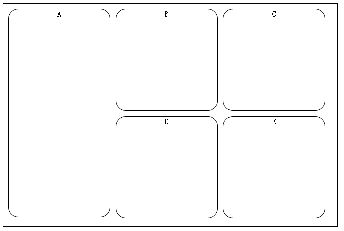
当然使用table和负边距也是可以实现的,有时间补上:-D
以上就是本文所述的全部内容了,希望大家能够喜欢。



