


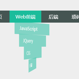
上面是一个效果图,代码在下面:
html
XML/HTML Code复制内容到剪贴板css:
CSS Code复制内容到剪贴板- *{
- margin:0 auto;
- }
- body{
- background-color: #EEEEEE;
- font-family: Microsoft Yahei,Arial,sans-serif;
- }
- nav{
- width: 100%;
- background-color: #455552;
- position: relative;
- width: 650px;
- margin-top: 100px;
- }
- .nav-ul{
- list-style: none;
- }
- .nav-ul>li{
- display: inline-block;
- position: relative;
- }
- .nav-ul a{
- text-decoration: none;
- color: #FFF;
- display: inline-block;
- padding: 10px 20px;
- }
- .nav-ul a:hover{
- background-color: #1ABC9C;
- }
- .nav-ul a:hover+ul li{
- opacity:1;
- -webkit-transform: rotateY(0deg);
- transform: rotateY(0deg);
- }
- .nav-ul a+ul{
- list-style: none;
- position: absolute;
- transition: opacity 0.5s;
- -webkit-perspective: 800;
- -webkit-transform-style: preserve-3d;
- }
- .nav-ul a+ul:hover li{
- opacity: 1;
- -webkit-transform: rotateY(0deg);
- transform: rotateY(0deg);
- }
- .nav-ul a+ul li{
- position: relative;
- left: -40px;
- opacity: 0;
- width: 150px;
- transition: transform 1.5s,opacity 0.8s;
- }
- .nav-ul a+ul a{
- display: inline-block;
- width: 75%;
- background-color: rgba(26,188, 156, 0.75);
- }
- .nav-effect-1{
- transform: rotateY(90deg) translateX(10px);
- }
- .nav-effect-2{
- transform: rotateY(120deg) translateX(20px);
- }
- .nav-effect-3{
- transform: rotateY(150deg) translateX(30px);
- }
- .nav-effect-4{
- transform: rotateY(180deg) translateX(40px);
- }
- .nav-ul a+ul a:hover{
- background-color: rgba(69,85, 82, 0.75);
- }
查看demo:demo



