栏目分类:
子分类:
返回
名师互学网用户登录
快速导航关闭
当前搜索
当前分类
子分类
实用工具
热门搜索
名师互学网 > IT > 软件开发 > Web开发 > Html/CSS > CSS教程

使用CSS3设计地图上的雷达定位提示效果

CSS教程 更新时间: 发布时间: IT归档 最新发布 模块sitemap 名妆网 法律咨询 聚返吧 英语巴士网 伯小乐 网商动力

近期工作要做一个用于图像定位的标识,为了让这个指示标识不死板,决定做个简单的动画,动画效果像波浪一样波动,这样标识就更美观好看了,喜欢的同学可以跟着来学,十分简单,欢迎指正交流。

先上效果图:
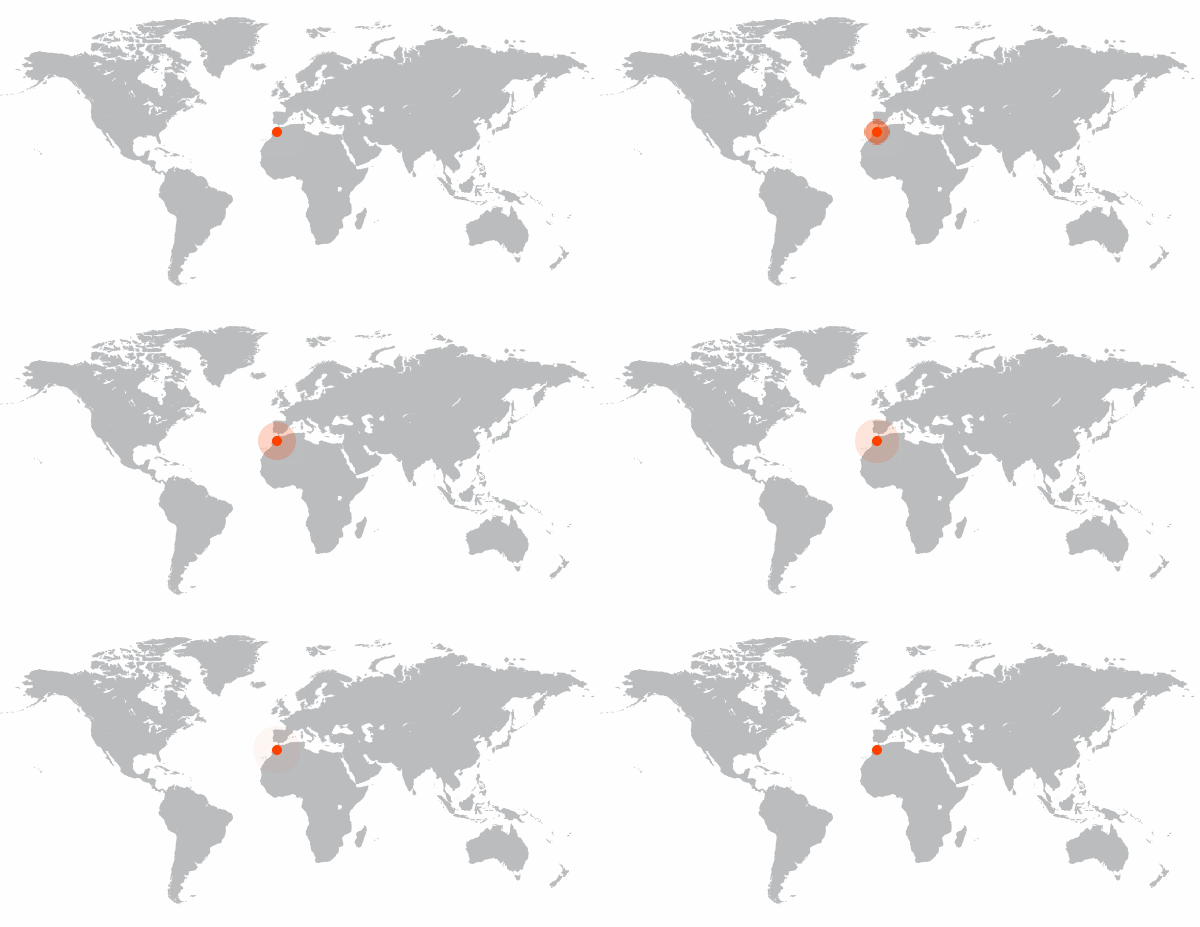
201645110412546.gif (600×309)

本动画需要用到的主要属性:animation, transition 和 Keyframes 属性
Step 1:HTML 代码:

XML/HTML Code复制内容到剪贴板
  1.   
  
  •   

    Step 2: CSS样式:设置animation属性

    CSS Code复制内容到剪贴板
    1. .dot:before{   
    2. content:' ';   
    3. position: absolute;   
    4. z-index:2;   
    5. left:0;   
    6. top:0;   
    7. width:10px;   
    8. height:10px;   
    9. background-color: #ff4200;   
    10. border-radius: 50%;   
    11. }   
    12.   
    13. .dot:after {   
    14. content:' ';   
    15. position: absolute;   
    16. z-index:1;   
    17. width:10px;   
    18. height:10px;   
    19. background-color: #ff4200;   
    20. border-radius: 50%;   
    21. box-shadow: 0 0 10px rgba(0,0,0,.3) inset;   
    22. -webkit-animation-name:'ripple';  
    23. -webkit-animation-duration: 1s;  
    24. -webkit-animation-timing-function: ease;   
    25. -webkit-animation-delay: 0s;  
    26. -webkit-animation-iteration-count: infinite;  
    27. -webkit-animation-direction: normal;  
    28. }  

    设置动画方式,像波浪一样,从小变大变无,所以我们要设置宽高从0 – 50px,透明度从有至无,这样就能实现水波涟漪效果啦。

    CSS Code复制内容到剪贴板
    1. @keyframes ripple {   
    2. 0% {   
    3. left:5px;   
    4. top:5px;   
    5. opcity:75;   
    6. width:0;   
    7. height:0;   
    8. }   
    9. 100% {   
    10. left:-20px;   
    11. top:-20px;   
    12. opacity: 0;   
    13. width:50px;   
    14. height:50px;   
    15. }   
    16. }  

    效果完成了,此案例比较适合图像定位标识用,当然还可以有更好的方案去代替,完善这个样式与动画效果。

    转载请注明:文章转载自 www.mshxw.com
    本文地址:https://www.mshxw.com/it/216009.html

    CSS教程相关栏目本月热门文章

    我们一直用心在做
    关于我们 文章归档 网站地图 联系我们

    版权所有 (c)2021-2022 MSHXW.COM

    ICP备案号:晋ICP备2021003244-6号

