栏目分类:
子分类:
返回
名师互学网用户登录
快速导航关闭
当前搜索
当前分类
子分类
实用工具
热门搜索
名师互学网 > IT > 软件开发 > Web开发 > Html/CSS > CSS教程

使用CSS3编写类似iOS中的复选框及带开关的按钮

CSS教程 更新时间: 发布时间: IT归档 最新发布 模块sitemap 名妆网 法律咨询 聚返吧 英语巴士网 伯小乐 网商动力

checkbox多选

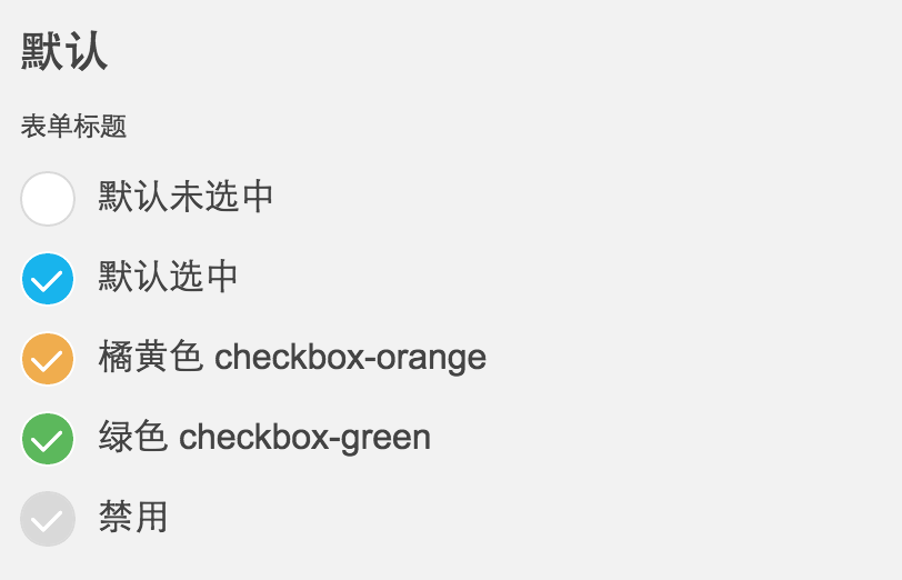
最近写了一个适合移动端的checkbox,如图:
2016411114913458.png (812×522)

ps:中间的勾勾是iconfont,iOS风格的。

具体的HTML:

XML/HTML Code复制内容到剪贴板

  1.   
  2.     
  3.         默认未选中  
  
  •   
  •     
  •         默认选中  
  •   
  •   
  •     
  •         橘黄色 checkbox-orange  
  •   
  •   
  •     
  •         绿色 checkbox-green  
  •   
  •   
  •     
  •         禁用  
  •   
  • CSS代码(SCSS导出的,排版有些奇怪):

    CSS Code复制内容到剪贴板
    1. .mui-checkbox {   
    2.   -webkit-appearance: none;   
    3.   position: relative;   
    4.   width: 25px;   
    5.   height: 25px;   
    6.   margin-right: 10px;   
    7.   background-color: #FFFFFF;   
    8.   border: solid 1px #d9d9d9;   
    9.   border-top-left-radius: 20px;   
    10.   border-top-rightright-radius: 20px;   
    11.   border-bottom-left-radius: 20px;   
    12.   border-bottom-rightright-radius: 20px;   
    13.   background-clip: padding-box;   
    14.   display: inline-block; }   
    15.   .mui-checkbox:focus {   
    16.     outline: 0 none;   
    17.     outline-offset: -2px; }   
    18.   .mui-checkbox:checked {   
    19.     background-color: #18b4ed;   
    20.     border: solid 1px #FFFFFF; }   
    21.     .mui-checkbox:checked:before {   
    22.       display: inline-block;   
    23.       margin-top: 1px;   
    24.       margin-left: 2px;   
    25.       font-family: iconfont;   
    26.       content: "e667";   
    27.       color: #FFFFFF;   
    28.       font-size: 18px; }   
    29.   .mui-checkbox:disabled {   
    30.     background-color: #d9d9d9;   
    31.     border: solid 1px #d9d9d9; }   
    32.     .mui-checkbox:disabled:before {   
    33.       display: inline-block;   
    34.       margin-top: 1px;   
    35.       margin-left: 2px;   
    36.       font-family: iconfont;   
    37.       content: "e667";   
    38.       color: #FFFFFF;   
    39.       font-size: 18px; }   
    40.   .mui-checkbox.checkbox-green:checked {   
    41.     background-color: #5cb85c; }   
    42.   .mui-checkbox.checkbox-orange:checked {   
    43.     background-color: #f0ad4e; }   
    44.   .mui-checkbox.checkbox-s {   
    45.     width: 19px;   
    46.     height: 19px; }   
    47.     .mui-checkbox.checkbox-s:before {   
    48.       display: inline-block;   
    49.       margin-top: 1px;   
    50.       margin-left: 2px;   
    51.       font-family: iconfont;   
    52.       content: "e667";   
    53.       color: #FFFFFF;   
    54.       font-size: 13px; }   
    55.     
    56. .mui-checkbox-anim {   
    57.   -webkit-transition: background-color ease 0.2s;   
    58.           transition: background-color ease 0.2s; }  

    SCSS代码:

    CSS Code复制内容到剪贴板
    1. @mixin checkedCon($fs:18px) {   
    2.   &:before {   
    3.     display: inline-block;   
    4.     margin-top: 1px;   
    5.     margin-left: 2px;   
    6.     font-family: iconfont;   
    7.     content: "e667";   
    8.     color: #FFFFFF;   
    9.     font-size: $fs;   
    10.   }   
    11. }   
    12. $duration: .4s;   
    13. .mui-checkbox {   
    14.   -webkit-appearance: none;   
    15.   position: relative;   
    16.   width: 25px;   
    17.   height: 25px;   
    18.   margin-right: 10px;   
    19.   background-color: #FFFFFF;   
    20.   border: solid 1px #d9d9d9;   
    21.   border-top-left-radius: 20px;   
    22.   border-top-rightright-radius: 20px;   
    23.   border-bottom-left-radius: 20px;   
    24.   border-bottom-rightright-radius: 20px;   
    25.   background-clip: padding-box;   
    26.   display: inline-block;   
    27.   &:focus {   
    28.     outline: 0 none;   
    29.     outline-offset: -2px  
    30.   }   
    31.   &:checked {   
    32.     background-color: #18b4ed;   
    33.     border: solid 1px #FFFFFF;   
    34.     @include checkedCon();   
    35.   }   
    36.   &:disabled {   
    37.     background-color: #d9d9d9;   
    38.     border: solid 1px #d9d9d9;   
    39.     @include checkedCon();   
    40.   }   
    41.   &.checkbox-green:checked {   
    42.     background-color: #5cb85c;   
    43.   }   
    44.   &.checkbox-orange:checked {   
    45.     background-color: #f0ad4e;   
    46.   }   
    47.   &.checkbox-s {   
    48.     width: 19px;   
    49.     height: 19px;   
    50.     @include checkedCon(13px);   
    51.   }   
    52. }   
    53.     
    54. .mui-checkbox-anim{   
    55.   //border等其他元素不做过渡效果,增加视觉差,更有动画效果   
    56.   transition: background-color ease $duration/2;   
    57.     
    58. }  

     
    带switch开关
    本身我做这一个ui的目的是支持移动端的页面,而webkit上也正好支持单标记的input元素是使用伪类(:before或:after),所以我没做更多的支持和优化,我只是想尽量的保持html干净,所以没用其他元素做模拟。如果你要使用在桌面应用上,或支持其他浏览器,可以自己稍微修改一下,反正我是没测试过。

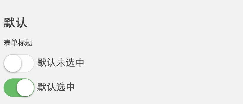
    今天继续分享一个iOS风格的switch开关按钮,样子也非常常见,如图:
    2016411115110047.png (818×350)

    主要是使用了来模拟实现,具体的HTML:

    XML/HTML Code复制内容到剪贴板
    1.   
    2.   
    3.   
    4.   
    5. 类即可  
    6.   

    在实际的使用中后来又增加了两个过渡效果,分别加 mui-switch-animbg和mui-switch-anim 类即可,具体效果查看下面的demo页面。

    CSS代码(SCSS导出的,排版有些奇怪):

    CSS Code复制内容到剪贴板
    1. .mui-switch {   
    2.   width: 52px;   
    3.   height: 31px;   
    4.   position: relative;   
    5.   border: 1px solid #dfdfdf;   
    6.   background-color: #fdfdfd;   
    7.   box-shadow: #dfdfdf 0 0 0 0 inset;   
    8.   border-radius: 20px;   
    9.   border-top-left-radius: 20px;   
    10.   border-top-rightright-radius: 20px;   
    11.   border-bottom-left-radius: 20px;   
    12.   border-bottom-rightright-radius: 20px;   
    13.   background-clip: content-box;   
    14.   display: inline-block;   
    15.   -webkit-appearance: none;   
    16.   user-select: none;   
    17.   outline: none; }   
    18.   .mui-switch:before {   
    19.     content: '';   
    20.     width: 29px;   
    21.     height: 29px;   
    22.     position: absolute;   
    23.     top: 0px;   
    24.     left: 0;   
    25.     border-radius: 20px;   
    26.     border-top-left-radius: 20px;   
    27.     border-top-rightright-radius: 20px;   
    28.     border-bottom-left-radius: 20px;   
    29.     border-bottom-rightright-radius: 20px;   
    30.     background-color: #fff;   
    31.     box-shadow: 0 1px 3px rgba(0, 0, 0, 0.4); }   
    32.   .mui-switch:checked {   
    33.     border-color: #64bd63;   
    34.     box-shadow: #64bd63 0 0 0 16px inset;   
    35.     background-color: #64bd63; }   
    36.     .mui-switch:checked:before {   
    37.       left: 21px; }   
    38.   .mui-switch.mui-switch-animbg {   
    39.     transition: background-color ease 0.4s; }   
    40.     .mui-switch.mui-switch-animbg:before {   
    41.       transition: left 0.3s; }   
    42.     .mui-switch.mui-switch-animbg:checked {   
    43.       box-shadow: #dfdfdf 0 0 0 0 inset;   
    44.       background-color: #64bd63;   
    45.       transition: border-color 0.4s, background-color ease 0.4s; }   
    46.       .mui-switch.mui-switch-animbg:checked:before {   
    47.         transition: left 0.3s; }   
    48.   .mui-switch.mui-switch-anim {   
    49.     transition: border cubic-bezier(0, 0, 0, 1) 0.4s, box-shadow cubic-bezier(0, 0, 0, 1) 0.4s; }   
    50.     .mui-switch.mui-switch-anim:before {   
    51.       transition: left 0.3s; }   
    52.     .mui-switch.mui-switch-anim:checked {   
    53.       box-shadow: #64bd63 0 0 0 16px inset;   
    54.       background-color: #64bd63;   
    55.       transition: border ease 0.4s, box-shadow ease 0.4s, background-color ease 1.2s; }   
    56.       .mui-switch.mui-switch-anim:checked:before {   
    57.         transition: left 0.3s; }   
    58.     
    59.   

    SCSS代码:

    CSS Code复制内容到剪贴板
    1. @mixin borderRadius($radius:20px) {   
    2.   border-radius: $radius;   
    3.   border-top-left-radius: $radius;   
    4.   border-top-rightright-radius: $radius;   
    5.   border-bottom-left-radius: $radius;   
    6.   border-bottom-rightright-radius: $radius;   
    7. }   
    8.     
    9. $duration: .4s;   
    10. $checkedColor: #64bd63;   
    11. .mui-switch {   
    12.   width: 52px;   
    13.   height: 31px;   
    14.   position: relative;   
    15.   border: 1px solid #dfdfdf;   
    16.   background-color: #fdfdfd;   
    17.   box-shadow: #dfdfdf 0 0 0 0 inset;   
    18.   @include borderRadius();   
    19.   background-clip: content-box;   
    20.   display: inline-block;   
    21.   -webkit-appearance: none;   
    22.   user-select: none;   
    23.   outline: none;   
    24.   &:before {   
    25.     content: '';   
    26.     width: 29px;   
    27.     height: 29px;   
    28.     position: absolute;   
    29.     top: 0px;   
    30.     left: 0;   
    31.     @include borderRadius();   
    32.     background-color: #fff;   
    33.     box-shadow: 0 1px 3px rgba(0, 0, 0, 0.4);   
    34.   }   
    35.   &:checked {   
    36.     border-color: $checkedColor;   
    37.     box-shadow: $checkedColor 0 0 0 16px inset;   
    38.     background-color: $checkedColor;   
    39.     &:before {   
    40.       left: 21px;   
    41.     }   
    42.   }   
    43.   &.mui-switch-animbg {   
    44.     transition: background-color ease $duration;   
    45.     &:before {   
    46.       transition: left 0.3s;   
    47.     }   
    48.     &:checked {   
    49.       box-shadow: #dfdfdf 0 0 0 0 inset;   
    50.       background-color: $checkedColor;   
    51.       transition: border-color $duration, background-color ease $duration;   
    52.       &:before {   
    53.         transition: left 0.3s;   
    54.       }   
    55.     }   
    56.     
    57.   }   
    58.   &.mui-switch-anim {   
    59.     transition: border cubic-bezier(0, 0, 0, 1) $duration, box-shadow cubic-bezier(0, 0, 0, 1) $duration;   
    60.     &:before {   
    61.       transition: left 0.3s;   
    62.     }   
    63.     &:checked {   
    64.       box-shadow: $checkedColor 0 0 0 16px inset;   
    65.       background-color: $checkedColor;   
    66.       transition: border ease $duration, box-shadow ease $duration, background-color ease $duration*3;   
    67.       &:before {   
    68.         transition: left 0.3s;   
    69.       }   
    70.     }   
    71.     
    72.   }   
    73. }  
    转载请注明:文章转载自 www.mshxw.com
    本文地址:https://www.mshxw.com/it/216007.html

    CSS教程相关栏目本月热门文章

    我们一直用心在做
    关于我们 文章归档 网站地图 联系我们

    版权所有 (c)2021-2022 MSHXW.COM

    ICP备案号:晋ICP备2021003244-6号
