栏目分类:
子分类:
返回
名师互学网用户登录
快速导航关闭
当前搜索
当前分类
子分类
实用工具
热门搜索
名师互学网 > IT > 软件开发 > Web开发 > Html/CSS > CSS教程

div+CSS制作类似微信对话气泡效果的实例总结

CSS教程 更新时间: 发布时间: IT归档 最新发布 模块sitemap 名妆网 法律咨询 聚返吧 英语巴士网 伯小乐 网商动力

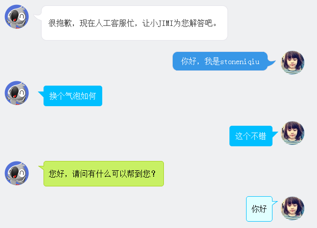
在聊天的场景中,聊天内容需要用到气泡修饰,如下图。下面一一讲解。
201641111629651.png (648×466)

一、图片式:

第一个样式是京东客服,气泡的圆角和钩子都是用了图片。使用了一个table组合成了一个圆角的框框。lm样式拼出了钩子。


XML/HTML Code复制内容到剪贴板
  1.   
  2.                 
  
  •                   
  •                       
  •                     

    很抱歉,现在人工客服忙,让小JIMI为您解答吧。

      
  •                       
  •                       
  •                   
  •             
  •   
  •               
  •                   
  •                     
  •   
  •                 
  •   
  •                 你好,我是stoneniqiu  
  •               
  • 样式:

    CSS Code复制内容到剪贴板
    1. .jimi_lists {   
    2.     margin: 0 -10px 20px 10px;   
    3.     position: relative;   
    4. }   
    5.  .jimi_lists .header_img.jimi3 {   
    6.     background: url(../img/jimi_50_3.png) no-repeat 0 0;   
    7. }   
    8.  .jimi_lists .header_img {   
    9.     width: 50px;   
    10.     height: 50px;   
    11.     position: absolute;   
    12.     top: 0;   
    13.     left: 0;   
    14. }   
    15. .fl {   
    16.     float: left;   
    17. }   
    18.  .jimi_lists .msg {   
    19.     margin-left: 59px;   
    20.     margin-right: 40px;   
    21.     margin-top: 2px;   
    22.     float: left;   
    23.     display: inline;   
    24. }   
    25.  .jimi_lists .lt {   
    26.     background: url(../img/msg_bg_lr.png) no-repeat 0 0;   
    27.     width: 26px;   
    28.     height: 10px;   
    29. }   
    30.  .jimi_lists .tt {   
    31.     background: url(../img/msg_bg_tb.png) repeat-x 0 -23px;   
    32.     height: 10px;   
    33. }   
    34. .jimi_lists .rt {   
    35.     background: url(../img/msg_bg_lr.png) no-repeat -35px 0;   
    36.     width: 10px;   
    37.     height: 10px;   
    38. }   
    39. .jimi_lists .lm {   
    40.     background: url(../img/msg_bg_lr.png) repeat-y -94px 0;   
    41.     width: 26px;   
    42.     vertical-align: top;   
    43.     position: relative;   
    44. }   
    45. .jimi_lists .mm {   
    46.     padding: 0 5px;   
    47.     background-color: #FFF;   
    48.     word-break: break-all;   
    49.     word-wrap: break-word;   
    50.     color: #333;   
    51.     line-height: 20px;   
    52. }   
    53. .jimi_lists .lm span {   
    54.     background: url(../img/msg_bg_lr.png) no-repeat 0 -14px;   
    55.     display: inline-block;   
    56.     width: 26px;   
    57.     height: 16px;   
    58.     position: absolute;   
    59.     top: 5px;   
    60. }   
    61. .jimi_lists .rm {   
    62.     background: url(../img/msg_bg_lr.png) repeat-y -113px 0;   
    63.     width: 10px;   
    64. }   
    65. .jimi_lists .lb {   
    66.     background: url(../img/msg_bg_lr.png) no-repeat 0 -43px;   
    67.     width: 10px;   
    68.     height: 10px;   
    69. }   
    70. .jimi_lists .bm {   
    71.     background: url(../img/msg_bg_tb.png) repeat-x 0 -25px;   
    72.     height: 10px;   
    73. }   
    74. .jimi_lists .rb {   
    75.     background: url(../img/msg_bg_lr.png) no-repeat -35px -43px;   
    76.     width: 10px;   
    77.     height: 10px;   
    78. }   
    79.   
    80. .customer_lists {   
    81.     position: relative;   
    82.     margin: 0 12px 20px 20px;   
    83. }   
    84. .customer_lists .msg {   
    85.     float: rightright;   
    86.     margin-right: 73px;   
    87.     _margin-rightright: 38px;   
    88.     margin-top: 2px;   
    89. }   
    90. .customer_lists .lt {   
    91.     background: url(../img/msg_bg_lr.png) no-repeat -47px -0;   
    92.     width: 10px;   
    93.     height: 10px;   
    94. }   
    95. .customer_lists .tt {   
    96.     background: url(../img/msg_bg_tb.png) repeat-x 0 0;   
    97.     height: 10px;   
    98. }   
    99. .customer_lists .rt {   
    100.     background: url(../img/msg_bg_lr.png) no-repeat -63px 0;   
    101.     width: 26px;   
    102.     height: 10px;   
    103. }   
    104. .customer_lists .lm {   
    105.     background: url(../img/msg_bg_lr.png) repeat-y -126px 0;   
    106.     width: 10px;   
    107. }   
    108. .customer_lists .mm {   
    109.     padding: 1px 8px;   
    110.     background-color: #3897E7;   
    111.     word-break: break-all;   
    112.     word-wrap: break-word;   
    113.     color: #FFF;   
    114. }   
    115. .customer_lists .rm {   
    116.     background: url(../img/msg_bg_lr.png) repeat-y -129px 0;   
    117.     width: 26px;   
    118.     vertical-align: top;   
    119.     position: relative;   
    120. }   
    121. .customer_lists .lb {   
    122.     background: url(../img/msg_bg_lr.png) no-repeat -47px -36px;   
    123.     width: 10px;   
    124.     height: 10px;   
    125. }   
    126. .customer_lists .bm {   
    127.     background: url(../img/msg_bg_tb.png) repeat-x -106px -4px;   
    128.     height: 10px;   
    129. }   
    130. .customer_lists .rb {   
    131.     background: url(../img/msg_bg_lr.png) no-repeat -63px -36px;   
    132.     width: 26px;   
    133.     height: 10px;   
    134. }   
    135.   
    136. .customer_lists .rm span {   
    137.     background: url(../img/msg_bg_lr.png) no-repeat -63px -14px;   
    138.     display: inline-block;   
    139.     width: 26px;   
    140.     height: 16px;   
    141.     position: absolute;   
    142.     top: 5px;   
    143. }   
    144.   
    145. .customer_lists .header_img_hover {   
    146.     position: absolute;   
    147.     background: url(../img/avatar_mask_01.png);   
    148.     top: 0;   
    149.     width: 50px;   
    150.     height: 50px;   
    151. }   
    152. .customer_lists .header_img {   
    153.     position: absolute;   
    154.     top: 0;   
    155.     rightright: 14px;   
    156.     width: 50px;   
    157.     height: 50px;   
    158. }   
    159.  .clearfix:after {   
    160.     content: " .";   
    161.     display: block;   
    162.     clear: both;   
    163.     visibility: hidden;   
    164.     height: 0;   
    165. }  

    二、背景式:

    第二种主要是使用了:before伪类画出了三角形,然后用定位拼在了一起。

    XML/HTML Code复制内容到剪贴板
    1.   
    2.                   
    3.                   
    4.                      

      换个气泡如何

        
    5.                   
    6.               
    7.               
    8.                   
    9.                       
    10.                   
    11.                   
    12.                     

      这个不错

        
    13.                   
    14.               

    (至于画三角形的方法稍后文章最后会总结一下)
    样式:           

    CSS Code复制内容到剪贴板
    1. .bkbubble.rightright p:before, .bkbubble.left p:before {   
    2.       width: 0;   
    3.     position: absolute;   
    4.     top: 12px;   
    5.     border-style: solid;   
    6.     content: "";   
    7.   }   
    8.   .bkbubble.left {   
    9.       text-align: rightright;   
    10.   }   
    11.  .bkbubble.rightright p:before {   
    12.      left: -12px;   
    13.     border-color: transparent #00bfff;   
    14.     border-width: 0 12px 12px 0;   
    15.  }   
    16.  .bkbubble.left p:before {   
    17.      rightright: -12px;   
    18.     border-color: transparent #00bfff;   
    19.     border-width: 0 0 12px 12px ;   
    20.  }             

              
    三、边框式:

    如果要求边框颜色和背景颜色不一样呢?上面的方法就不行了,因为用:before画三角形是利用border的原理,也就是说,在上面这种方式下,气泡边上的小三形是无法呈现两种颜色的,因为他只有一个border的颜色。那就要想办法凑出一个有边框的三角形了。

    XML/HTML Code复制内容到剪贴板
    1.   
    2.                   
    3.                 您好,请问有什么可以帮到您?

        
    4.                   
    5.               

    1.先画一个小矩形。

    CSS Code复制内容到剪贴板
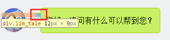
    1. .lim_operator .lim_tale {   
    2.     left: -1px;   
    3.     background-color: #c8f064;   
    4.     border-color: #a5d01b;   
    5.     margin-left: 70px;   
    6. }   
    7. .lim_tale {   
    8.     position: absolute;   
    9.     width: 12px;   
    10.     height: 8px;   
    11.     overflow: hidden !important;   
    12.     top: 10px;   
    13.     z-index: 2;   
    14.     border-top-style: solid;   
    15.     border-top-width: 1px;   
    16. }  

    201641111707634.png (349×82)

    2.画出斜线。

    css里面是没有斜线的,这里是用了一个园的弧形拼出来的。在一个大圆上,截取一段弧,就是一条斜线了。

    CSS Code复制内容到剪贴板
    1. .lim_operator .radiusborder {   
    2.     position: absolute;   
    3.     background-color: #EFF0F2;   
    4.     top: -29px;   
    5.     left: -94px;   
    6.     height: 160px;   
    7.     width: 160px;   
    8.     border-top-style: solid;   
    9.     border-top-width: 1px;   
    10.     border-right-style: solid;   
    11.     border-right-width: 1px;   
    12.     border-top-rightright-radius: 154px;   
    13.     border-color: #a5d01b;   
    14. }  

    四、叠加式:

    原理就是相当于用before先画出一个有色背景,再用after画出一个白色背景,然后叠加错开顶部1-2px,这样就出现了一个有边框有背景的三角形。web 微信就是这种做法

    CSS Code复制内容到剪贴板
    1. .expression:before {   
    2.     content: '';   
    3.     position: absolute;   
    4.     left: 16px;   
    5.     top: 100%;   
    6.     margin-left: -7px;   
    7.     border: 7px solid transparent;   
    8.     border-top-color: #CFCFCF  
    9. }   
    10.   
    11. .expression:after {   
    12.     content: '';   
    13.     position: absolute;   
    14.     left: 16px;   
    15.     top: 100%;   
    16.     margin-left: -7px;   
    17.     margin-top: -1px;   
    18.     border: 7px solid transparent;   
    19.     border-top-color: #FFF  
    20. }  

    PS:三角形的简单绘制:
    1.CSS 边框
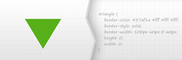
    201641111800289.png (600×200)

    这也是一个常用的使用方式,如tooltips信息提示框和下拉菜单。以上的示例,这是一个我最喜欢的方法创建小而且有用的三角形。

    优点:

    很容易的通过修改一些CSS代码属性值而更改颜色和大小
    这是一个跨浏览器的解决方案。
    缺点:

    这个方式使用的是border,所以你不能添加阴影、渐变、和其他一些CSS3效果
    请记住,IE6是不支持透明边界的-如果你关心这个问题
    2.HTML 字符
    201641111819677.png (600×200)

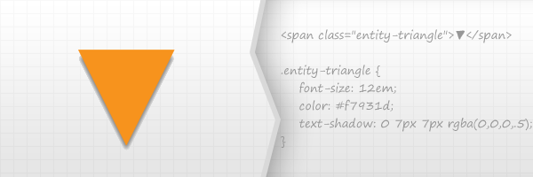
    它是基于使用可用的Unicode字符列表的字符。

    优点

    它是一个跨浏览器的技术
    您可以使用CSS3的text-shadow属性添加阴影。
    缺点

    不能使用太多的CSS3效果,除了使用文字阴影。
    在所有的浏览器,这是相当不可能实现像素完美。
    3.CSS 旋转正方形
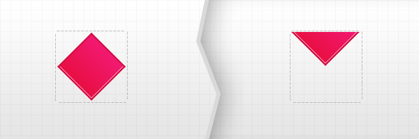
    201641111841502.png (600×200)

    理论上,这种方式,你需要使用两个内容块,但是,并没有限制是使用两个元素,所以可以使用一个元素加一个伪元素。

    创建一个内容里。例如100×100像素 – 这将包含旋转块。
    旋转包含的这个块45度,从而获得一个菱形
    将菱形的块向顶部便宜,然后设置溢出,设置父层容器截断
    There you go!
    优点:

    CSS3阴影,渐变等可以更多的使用
    缺点:

    这个解决方案不是跨浏览器的,首先是因为CSS3旋转。        

    转载请注明:文章转载自 www.mshxw.com
    本文地址:https://www.mshxw.com/it/215978.html

    CSS教程相关栏目本月热门文章

    我们一直用心在做
    关于我们 文章归档 网站地图 联系我们

    版权所有 (c)2021-2022 MSHXW.COM

    ICP备案号:晋ICP备2021003244-6号