栏目分类:
子分类:
返回
名师互学网用户登录
快速导航关闭
当前搜索
当前分类
子分类
实用工具
热门搜索
名师互学网 > IT > 软件开发 > Web开发 > Html/CSS > CSS教程

CSS3实现可爱的小黄人动画

CSS教程 更新时间: 发布时间: IT归档 最新发布 模块sitemap 名妆网 法律咨询 聚返吧 英语巴士网 伯小乐 网商动力

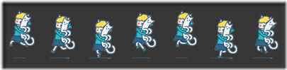
每次看到CSS3动画就心痒痒想试一下,记得一个多月前看了白树哥哥的一篇博客,突然开窍,于是拿他提供的demo试了一下,感觉很棒!下图为demo提供的动画帧设计稿。


自己也想说搞一个DIY的动画出来,可是,会PS不一定会设计啊,我搞不出一套动画设计稿出来啊【抓狂】….于是乎,去了站酷网找找素材,我果然还是太天真了,最后从心只找到了一张图:



联想到我要做CSS3动画,呵呵……怎么办 ? ——没办法,抠呗!(此处勿喷,着实无素材)

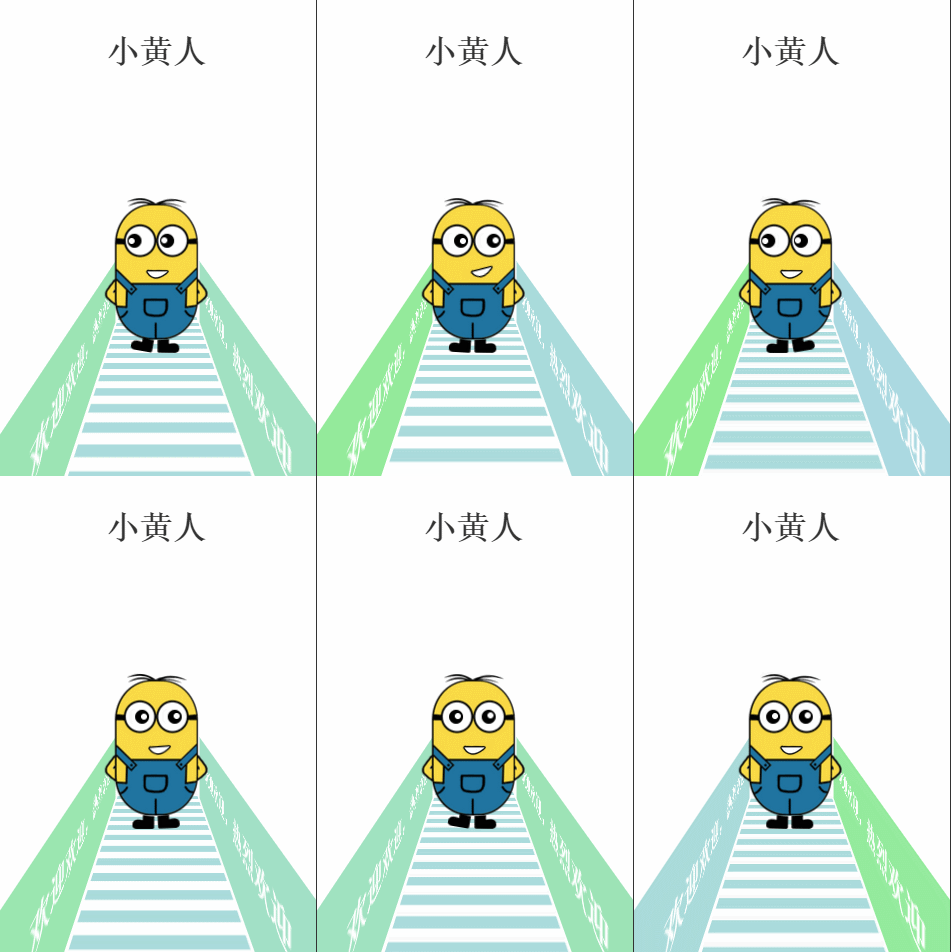
……最后效果变成这样子,这是移动端的例子!(gif图有卡顿现象,请凑合看吧,非喜勿喷…):


OK,其实主要目的还是知识点的学习吧:

这个demo涉及的知识点有:

perspective

perspective-origin

transform-style

transform-origin

animation

@keyframes

translate3d,translateX,rotateY….

这些知识点有些涉及css3d动画,各个知识点的具体详解我就不解释了,有兴趣可以到这里了解一下:http://isux.tencent.com/css3/index.html

回到这个案例,话说这么挫的动画是怎么具体实现的呢? 我将分享代码给大家练习:

html结构:

XML/HTML Code复制内容到剪贴板
  1.   
  2.       
  3.         

    小黄人

      
  4.     
  
  •       
  •           
  •               
  •                   
  •                     

    欢迎欢迎,热烈欢迎

      
  •                 
  •   
  •                   
  •                     

    欢迎欢迎,热烈欢迎

      
  •                 
  •   
  •                 
  •   
  •               
  •               
  •                   
  •                   
  •                   
  •                   
  •                   
  •                   
  •                   
  •                   
  •                   
  •               
  •           
  •       
  •   
  • css代码:

    CSS Code复制内容到剪贴板
    1. body{   
    2.             margin: 0;   
    3.             padding: 0;   
    4.             width: 100%;   
    5.             height: 100%;   
    6.         }   
    7.         .title p{   
    8.             text-align: center;   
    9.             font-size: 100px;   
    10.             font-weight: bolder;   
    11.             color:#333;   
    12.         }   
    13.         .wrapper{   
    14.             margin: 400px auto;   
    15.         }   
    16.         .littleH{   
    17.             position: relative;   
    18.             -webkit-perspective: 800;   
    19.             -webkit-perspective-origin: 50% 50%;   
    20.         }   
    21.         .light{   
    22.             -webkit-transform-style: preserve-3d;   
    23.         }   
    24.         .light .light_left,.light .light_right{   
    25.             position: absolute;   
    26.             width: 100%;   
    27.             height: 300px;   
    28.             background: lightblue;   
    29.             -webkit-transform: rotateY(90deg) translate3d(0,300px,-200px);   
    30.             -webkit-animation: changeBgColor 2s linear infinite;   
    31.         }   
    32.         .light .light_right{   
    33.             -webkit-transform: rotateY(-90deg) translate3d(0,300px,-215px);   
    34.             -webkit-animation-delay: 1s;   
    35.         }   
    36.         @-webkit-keyframes changeBgColor{   
    37.             0%,100%{   
    38.                 background: lightblue;   
    39.             }   
    40.             50%{   
    41.                 background: lightgreen;   
    42.             }   
    43.         }   
    44.         .light .light_left p,.light .light_right p{   
    45.             color:#fff;   
    46.             font-size: 80px;   
    47.             font-weight: bold;   
    48.             margin-left: 100px;   
    49.         }   
    50.         .light .light_right p{   
    51.             float: rightright;   
    52.             margin-right: 100px;   
    53.         }   
    54.         .light .load{   
    55.             position: absolute;   
    56.             width: 500px;   
    57.             height: 1500px;   
    58.             background: -webkit-gradient(linear, left top, left bottombottom, color-stop(51%,#aadbdc), color-stop(52%,#ffffff));   
    59.             background: -webkit-linear-gradient(top, #aadbdc 51%,#ffffff 52%);   
    60.             background: linear-gradient(to bottombottom, #aadbdc 51%,#ffffff 52%);    
    61.             background-size: 350px 80px;   
    62.             -webkit-animation: move_load 5s linear infinite;   
    63.         }   
    64.         @-webkit-keyframes move_load{   
    65.             0%{   
    66.                 -webkit-transform:rotateX(90deg) translate3d(250px,0,0);   
    67.             }   
    68.             100%{   
    69.                 -webkit-transform:rotateX(90deg) translate3d(250px,-320px,0);   
    70.             }   
    71.         }   
    72.         .littleH_body{   
    73.             position: absolute;   
    74.             left:50%;   
    75.             margin-left: -157px;   
    76.             width: 314px;   
    77.             height: 425px;   
    78.             background: url(1.png);   
    79.             -webkit-transform-style: preserve-3d;   
    80.         }   
    81.         .leftHair{   
    82.             position: absolute;   
    83.             rightright: 58px;   
    84.             top:-5px;   
    85.             width: 100px;   
    86.             height: 17px;   
    87.             background: url(lefthair.png);   
    88.             -webkit-transform-origin: left bottombottom;   
    89.             -webkit-animation: lefthair 1s .3s ease-in-out infinite;   
    90.   
    91.         }   
    92.         @-webkit-keyframes lefthair{   
    93.             0%,10%,40%,100%{   
    94.                 -webkit-transform: rotate(0deg) translateY(1px);   
    95.             }   
    96.             30%{   
    97.                 -webkit-transform: rotate(-3deg) translateY(1px);   
    98.             }   
    99.         }   
    100.         .rightHair{   
    101.             position: absolute;   
    102.             left: 58px;   
    103.             top:-8px;   
    104.             width: 100px;   
    105.             height: 16px;   
    106.             background: url(righthair.png);   
    107.             -webkit-transform-origin: rightright bottombottom;   
    108.             -webkit-animation: righthair 1s ease-in-out infinite;   
    109.         }   
    110.         @-webkit-keyframes righthair{   
    111.             0%,10%,40%,100%{   
    112.                 -webkit-transform: rotate(0deg) translateY(1px);   
    113.             }   
    114.             30%{   
    115.                 -webkit-transform: rotate(4deg) translateY(1px);   
    116.             }   
    117.         }   
    118.         .leftBlackeye{   
    119.             position: absolute;   
    120.             rightright: 87px;   
    121.             top:102px;   
    122.             width: 43px;   
    123.             height: 43px;   
    124.             background: url(eyeblack.png);   
    125.             -webkit-animation: leftblackeye 5s ease-in infinite;   
    126.         }   
    127.         @-webkit-keyframes leftblackeye{   
    128.             0%,20%,50%,70%,100%{   
    129.                 -webkit-transform: translateX(0px);   
    130.             }   
    131.             30%,40%{   
    132.                 -webkit-transform: translateX(15px);   
    133.             }   
    134.             80%,90%{   
    135.                 -webkit-transform: translateX(-15px);   
    136.             }   
    137.         }   
    138.         .leftWhiteeye{   
    139.             position: absolute;   
    140.             rightright: 92px;   
    141.             top:110px;   
    142.             width: 20px;   
    143.             height: 21px;   
    144.             background: url(whiteeye.png);   
    145.             background-size: 95% 95%;   
    146.             background-repeat: no-repeat;   
    147.             -webkit-animation: leftwhiteeye 5s ease-in infinite;   
    148.         }   
    149.         @-webkit-keyframes leftwhiteeye{   
    150.             0%,20%,50%,70%,100%{   
    151.                 -webkit-transform: translateX(0px);   
    152.             }   
    153.             30%,40%{   
    154.                 -webkit-transform: translate3d(15px,3px,0);   
    155.             }   
    156.             80%,90%{   
    157.                 -webkit-transform: translate3d(-30px,3px,0);   
    158.             }   
    159.         }   
    160.         .rightBlackeye{   
    161.             position: absolute;   
    162.             left: 84px;   
    163.             top:102px;   
    164.             width: 43px;   
    165.             height: 43px;   
    166.             background: url(eyeblack.png);   
    167.             -webkit-animation: rightblackeye 5s ease-in infinite;   
    168.         }   
    169.         @-webkit-keyframes rightblackeye{   
    170.             0%,20%,50%,70%,100%{   
    171.                 -webkit-transform: translateX(0px);   
    172.             }   
    173.             30%,40%{   
    174.                 -webkit-transform: translateX(15px);   
    175.             }   
    176.             80%,90%{   
    177.                 -webkit-transform: translateX(-15px);   
    178.             }   
    179.         }   
    180.         .rightWhiteeye{   
    181.             position: absolute;   
    182.             left: 102px;   
    183.             top:112px;   
    184.             width: 20px;   
    185.             height: 21px;   
    186.             background: url(whiteeye.png);   
    187.             background-size: 95% 95%;   
    188.             background-repeat: no-repeat;   
    189.             -webkit-animation: rightwhiteeye 5s ease-in infinite;   
    190.         }   
    191.         @-webkit-keyframes rightwhiteeye{   
    192.             0%,20%,50%,70%,100%{   
    193.                 -webkit-transform: translateX(0px);   
    194.             }   
    195.             30%,40%{   
    196.                 -webkit-transform: translate3d(15px,3px,0);   
    197.             }   
    198.             80%,90%{   
    199.                 -webkit-transform: translate3d(-30px,3px,0);   
    200.             }   
    201.         }   
    202.         .mouse{   
    203.             position: absolute;   
    204.             left: 126px;   
    205.             top:210px;   
    206.             width: 71px;   
    207.             height: 30px;   
    208.             background: url(mouse.png);   
    209.             -webkit-transform-origin: center top;   
    210.             -webkit-animation: mouse 5s ease-in-out infinite;   
    211.         }   
    212.         @-webkit-keyframes mouse{   
    213.             40%{   
    214.                 -webkit-transform: rotate(-15deg) translateX(22px);   
    215.             }   
    216.             0%,20%,60%,100%{   
    217.                 -webkit-transform: rotate(0deg);   
    218.             }   
    219.         }   
    220.         .leftFoot{   
    221.             position: absolute;   
    222.             rightright: 85px;   
    223.             top:424px;   
    224.             width: 68px;   
    225.             height: 43px;   
    226.             background: url(leftfoot.png);   
    227.             -webkit-transform-origin: left top;   
    228.             -webkit-animation: leftfoot .6s ease-in-out infinite;   
    229.         }   
    230.         @-webkit-keyframes leftfoot{   
    231.             0%,50%,100%{   
    232.                 -webkit-transform: rotate(0deg);   
    233.             }   
    234.             80%{   
    235.                 -webkit-transform: rotate(-10deg);   
    236.             }   
    237.         }   
    238.         .rightFoot{   
    239.             position: absolute;   
    240.             left: 85px;   
    241.             top:424px;   
    242.             width: 68px;   
    243.             height: 43px;   
    244.             background: url(rightfoot.png);   
    245.             margin-bottom: 100px;   
    246.             -webkit-transform-origin: rightright top;   
    247.             -webkit-animation: rightfoot .6s ease-in-out infinite;   
    248.         }   
    249.         @-webkit-keyframes rightfoot{   
    250.             0%,50%,100%{   
    251.                 -webkit-transform: rotate(0deg);   
    252.             }   
    253.   
    254.             30%{   
    255.                 -webkit-transform: rotate(10deg);   
    256.             }   
    257.         }   

    代码应该还是很简单就能看懂的,不足之处在于图片没有合并,就凑合吧,主要目的还是对CSS3动画(特别是3d)知识点的学习及实践。多练习,才能记得更牢,用得更顺,这只是开始……

    PS:附上我抠的图片


    1.png


    righthair.png


    lefthair.png


    eyeblack.png


    whiteeye.png


    mouse.png


    rightfoot.png


    leftfoot.png

    以上就是本文的全部内容,希望对大家的学习有所帮助,也希望大家多多支持考高分网。

    原文链接:http://www.cnblogs.com/jr1993/p/4654622.html

    转载请注明:文章转载自 www.mshxw.com
    本文地址:https://www.mshxw.com/it/215760.html

    CSS教程相关栏目本月热门文章

    我们一直用心在做
    关于我们 文章归档 网站地图 联系我们

    版权所有 (c)2021-2022 MSHXW.COM

    ICP备案号:晋ICP备2021003244-6号