
栏目分类:
子分类:
返回
名师互学网用户登录
快速导航关闭
当前搜索
当前分类
子分类
实用工具
热门搜索
名师互学网 > IT > 软件开发 > Web开发 > Html/CSS > CSS教程

CSS3实现时间轴效果

CSS教程 更新时间: 发布时间: IT归档 最新发布 模块sitemap 名妆网 法律咨询 聚返吧 英语巴士网 伯小乐 网商动力

最近打开电脑就能看到极客学院什么新用户vip免费一个月,就进去看看咯,这里就不说它的课程怎么滴了,里面实战路径图页面看到了这个效果: 
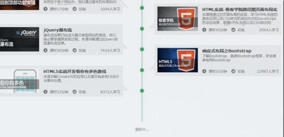
有点像时间轴的赶脚,而且每一块鼠标悬浮上去也有下拉效果展开介绍截图信息,就感觉效果还不错。但感觉这种效果貌似对于动态添加不是很灵活,因为高度不像宽度可以灵活的自适应,故添加得自己一个一个设置。所以很多都是做成展示效果。
 
当然啦,自己也基于它的这个想法搞了一点简单点的类似效果,主要还是整个布局效果,具体每一块内容就不仿造了,而且我自己也加了一下开场动画,让它更好玩一些…
 
先来看看效果吧: 

大概效果就是这样啦,下来废话不说,还是直接进入主题:
 
HTML结构:

XML/HTML Code复制内容到剪贴板
  1.   
  2.               
  3.                 

    2015-07-02

      
  4.                 
      
  5.                     

    暴走大事件第一季

      
  6.                     
        
    •   
    •                     
      
  7.                 
  
  •             
  •   
  •               
  •                 

    2015-07-02

      
  •                 
      
  •                     

    暴走大事件第二季

      
  •                     
        
    •   
    •                     
      
  •                 
  •   
  •     
  •   
  • 这里简化了一下HTML结构,.time类表示在右边,.timeLeft表示在左边,然后加点上外边距就可以了,每一块里面的内容我就删减掉了。
     
    CSS样式代码如下:

    CSS Code复制内容到剪贴板
    1. body{   
    2.                 background: #333;   
    3.             }   
    4.             h1{   
    5.                 text-align: center;   
    6.                 color:#fff;   
    7.             }   
    8.             .timezone{   
    9.                 width:6px;   
    10.                 height: 350px;   
    11.                 background: lightblue;   
    12.                 margin: 0 auto;   
    13.                 margin-top:50px;   
    14.                 border-radius: 3px;   
    15.                 position: relative;   
    16.                 -webkit-animation: heightSlide 2s linear;   
    17.             }   
    18.             @-webkit-keyframes heightSlide{   
    19.                 0%{   
    20.                     height: 0;   
    21.                 }   
    22.                 100%{   
    23.                     height: 350px;   
    24.                 }   
    25.             }   
    26.             .timezone:after{   
    27.                 content: '未完待续...';   
    28.                 width: 100px;   
    29.                 color:#fff;   
    30.                 position: absolute;   
    31.                 margin-left: -35px;   
    32.                 bottombottom: -30px;   
    33.                 -webkit-animation: showIn 4s ease;   
    34.             }   
    35.             .timezone .time,.timezone .timeLeft{   
    36.                 position: absolute;   
    37.                 margin-left: -10px;   
    38.                 margin-top:-10px;   
    39.                 width:20px;   
    40.                 height:20px;   
    41.                 border-radius: 50%;   
    42.                 border:4px solid rgba(255,255,255,0.5);   
    43.                 background: lightblue;   
    44.                 -webkit-transition: all 0.5s;   
    45.                 -webkit-animation: showIn ease;   
    46.             }   
    47.             .timezone .time:nth-child(1){   
    48.                 -webkit-animation-duration:1s;   
    49.             }   
    50.             .timezone .timeLeft:nth-child(2){   
    51.                 -webkit-animation-duration:1.5s;   
    52.             }   
    53.             .timezone .time:nth-child(3){   
    54.                 -webkit-animation-duration:2s;   
    55.             }   
    56.             .timezone .timeLeft:nth-child(4){   
    57.                 -webkit-animation-duration:2.5s;   
    58.             }   
    59.             @-webkit-keyframes showIn{   
    60.                 0%,70%{   
    61.                     opacity: 0;   
    62.                 }   
    63.                 100%{   
    64.                     opacity: 1;   
    65.                 }   
    66.             }   
    67.             .timezone .time h2,.timezone .timeLeft h2{   
    68.                 position: absolute;   
    69.                 margin-left: -120px;   
    70.                 margin-top: 3px;   
    71.                 color:#eee;   
    72.                 font-size: 14px;   
    73.                 cursor:pointer;   
    74.                 -webkit-animation: showIn 3s ease;   
    75.             }   
    76.             .timezone .timeLeft h2{   
    77.                 margin-left: 60px;   
    78.                 width: 100px;   
    79.             }   
    80.             .timezone .time:hover,.timezone .timeLeft:hover{   
    81.                 border:4px solid lightblue;   
    82.                 background: lemonchiffon;   
    83.                 box-shadow: 0 0 2px 2px rgba(255,255,255,0.4);   
    84.             }   
    85.             .timezone .time div,.timezone .timeLeft div{   
    86.                 position: absolute;   
    87.                 top:50%;   
    88.                 margin-top: -25px;   
    89.                 left:50px;   
    90.                 width: 300px;   
    91.                 height: 50px;   
    92.                 background: lightblue;   
    93.                 border:3px solid #eee;   
    94.                 border-radius: 10px;   
    95.                 z-index: 2;   
    96.                 overflow: hidden;   
    97.                 cursor:pointer;   
    98.                 -webkit-animation: showIn 3s ease;   
    99.                 -webkit-transition: all 0.5s;   
    100.             }   
    101.             .timezone .timeLeft div{   
    102.                 left:-337px;   
    103.             }   
    104.             .timezone .time div:hover,.timezone .timeLeft div:hover{   
    105.                 height: 170px;   
    106.             }   
    107.             .timezone .time div p,.timezone .timeLeft div p{   
    108.                 color: #fff;   
    109.                 font-weight: bold;   
    110.                 text-align: center;   
    111.             }   
    112.             .timezone .time:before,.timezone .timeLeft:before{   
    113.                 content: '';   
    114.                 position: absolute;   
    115.                 top:0px;   
    116.                 left: 32px;   
    117.                 width: 0px;   
    118.                 height: 0px;   
    119.                 border:10px solid transparent;   
    120.                 border-right:10px solid #eee;   
    121.                 z-index:-1;   
    122.                 -webkit-animation: showIn 3s ease;   
    123.             }   
    124.             .timezone .timeLeft:before{   
    125.                 left:-33px;   
    126.                 border:10px solid transparent;   
    127.                 border-left:10px solid #eee;   
    128.             }   
    129.             .timezone .time div ul,.timezone .timeLeft div ul{   
    130.                 list-style: none;   
    131.                 width:300px;   
    132.                 padding:5px 0 0;   
    133.                 border-top:2px solid #eee;   
    134.                 color:#fff;   
    135.                 text-align: center;   
    136.             }   
    137.             .timezone .time div li,.timezone .timeLeft div li{   
    138.                 display: inline-block;   
    139.                 height: 25px;   
    140.                 line-height: 25px;   
    141.             }    
    142.   

    此CSS样式代码仅供参考,实用性不是很强,而且同样没有怎么整理过,主要还是理解一下动画效果还有整体布局吧。祝好!

    以上就是本文的全部内容,希望对大家的学习有所帮助,也希望大家多多支持考高分网。

    原文链接:http://www.cnblogs.com/jr1993/p/4626815.html

    转载请注明:文章转载自 www.mshxw.com
    本文地址:https://www.mshxw.com/it/215747.html

    CSS教程相关栏目本月热门文章

    我们一直用心在做
    关于我们 文章归档 网站地图 联系我们

    版权所有 (c)2021-2022 MSHXW.COM

    ICP备案号:晋ICP备2021003244-6号
