


效果图如下
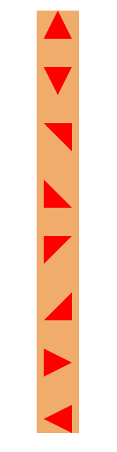
示例代码
 *{
     margin: 0;
     padding: 0;
 }
 .box{
     margin: 40px auto;
     width: 60px;
     background-color: #f0ac6b;
 }
 .t1{
     margin: 40px auto;
     width: 0px;
     height: 0px;

     border-bottom: 40px solid red;
     border-right: 20px solid transparent;
     border-left: 20px solid transparent;
 }
 .t2{
     margin: 40px auto;
     width: 0px;
     height: 0px;

     border-bottom: 40px solid transparent;
     border-right: 40px solid red;

 }
 .t3{
     margin: 40px auto;
     width: 0;
     height: 0;
     border-top: 40px solid red;
     border-right: 20px solid transparent;
     border-left: 20px solid transparent;
 }
 .t4{
     margin: 40px auto;
     width: 0;
     height: 0;
     border-top: 40px solid transparent;
     border-left: 40px solid red;
 }
 .t5{
     margin: 40px auto;
     width: 0;
     height: 0;
     border-top: 40px solid red;
     border-right: 40px solid transparent;
 }
 .t6{
     margin: 40px auto;
     width: 0px;
     height: 0px;
     border-left: 40px solid transparent;
     border-bottom: 40px solid red;
 }
 .t7{
     margin: 40px auto;
     width: 0;
     height: 0;
     border-left: 40px solid red;
     border-bottom: 20px solid transparent;
     border-top: 20px solid transparent;
 }
 .t8{
     margin: 40px auto;
     width: 0;
     height: 0;
     border-right: 40px solid red;
     border-bottom: 20px solid transparent;
     border-top: 20px solid transparent;
 }
总结
以上就是这篇文章的全部内容了,希望本文的内容对大家的学习或者工作能带来一定的帮助,如果有疑问大家可以留言交流。



