


效果图如下
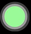
实例代码如下
   body{
    background: #000;
   }
   .box{
    width: 100%;
    height: 600px;
    background: #000;
   }
   .vr {
    display: block;
    width: 71px;
    height: 71px;
    border-radius: 50%;
    position: absolute;
    left: 18px;
    top: 22px;
    background:#98FB98 url(../imges/new_img/vr.png) no-repeat left top;
    background-size: 100% 100%;
    z-index: 99;
   }

   .vr_wrap {
    background: #fff;
    opacity: 0.7;
    filter: alpha(opacity=70);
    width: 71px;
    height: 71px;
    border-radius: 50%;
    position: absolute;
    left: 18px;
    top: 22px;
    box-shadow: 0px 0px 50px 10px #fbfbfb;
    animation: mymove 2s infinite;

    border-radius: 50%;
   }

   .vr_wrap2 {
    background: #fff;
    opacity: 0.9;
    filter: alpha(opacity=90);
    border-radius: 50%;
    width: 71px;
    height: 71px;
    border-radius: 50%;
    position: absolute;
    left: 18px;
    top: 22px;
    box-shadow: 0px 0px 50px 10px #fbfbfb;
    animation: mymove1 2s infinite;

   }

   @keyframes mymove {
    0% {
     box-shadow: 0px 0px 0px 2px #fff;
     height: 71px;
     width: 71px;
    }
    100% {
     box-shadow: 0px 0px 0px 20px #fff;
     height: 72px;
     width: 72px;
    }
    100% {
     opacity: 0;
     filter: alpha(opacity=0);
    }
   }

   @keyframes mymove1 {
    0% {
     box-shadow: 0px 0px 0px 2px #fff;
     height: 71px;
     width: 71px;
    }
    50% {
     box-shadow: 0px 0px 0px 20px #fff;
     height: 72px;
     width: 72px;
     opacity: 0;
    }
    100% {
     opacity: 0;
     filter: alpha(opacity=0);
    }
   }
总结
以上就是这篇文章的全部内容了,希望本文的内容对大家的学习或者工作能带来一定的帮助,如果有疑问大家可以留言交流,谢谢大家对考高分网的支持。



