


前言
本文介绍的是css3的3d模块,对大家具有一定的参考价值,感兴趣的朋友们下面来一起看看吧。
介绍
首先,我们来了解一下3d的坐标系,x轴在屏幕上为水平方向,y轴为垂直方向,而z轴为垂直于屏幕的方向。
不理解的话可以参考定位属性的z-index属性,那个在某种意义上就是让元素在z轴的移动。
在2d转换模块中我们研究了rotateX()和rotateY()方法,就是绕x轴和y轴旋转,这其实就是3d模块的一种表现,当然要看到近大远小的3d效果,还需要在父元素上添加透视属性:transform:perspective(500px);值为透视点到元素的距离,具体概念请看美术透视教学。。。。
多说无益,上代码:
    Title

 div{
     width: 200px;
     height: 200px;
     margin: 0 auto;
 }
 .div1{
     margin-top: 100px;
     transform:perspective(500px) rotatey(0deg);
     position: relative;
     border:1px solid #000000;
     background-color: #ff0000;
 }
 .div1 div{
       transform:rotatey(45deg);

     position: absolute;
     font-size: 80px;
     line-height: 200px;
     text-align: center;
     top: 0;
     left: 0;
 }


    1
效果图:
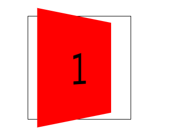
但是,你会发现当父元素转到90度的时候元素消失了,这就说明元素是没有厚度的。说明元素虽然具有了近大远小的透视属性,但本质上仍是2d的。
这是你需要添加transform-style:preserve-3d;样式来让元素在3d空间中转换。这样,元素就处在了3维的空间里,当父元素旋转90度,仍能看到里面的子元素。
示例代码:
    Title

 div{
     width: 200px;
     height: 200px;
     margin: 0 auto;
 }
 .div1{
     margin-top: 100px;
     transform:perspective(500px) rotatey(0deg);
     transform-style:preserve-3d;
     position: relative;
     border:1px solid #000000;
 }
 .div1 div{
     background-color: #ff0000;
     transform:rotatey(45deg);
     position: absolute;
     font-size: 80px;
     line-height: 200px;
     text-align: center;
     top: 0;
     left: 0;
 }


    1
效果图:

上面,我们对3d转换模块有了一个初步的了解,下面我们一起做一个正方体,来整理一下3d模块的知识。
一步步来做着写太过麻烦,我就将过程写在代码的注释里,小伙伴们请见谅。
代码:
转换模块-正方体
*{
margin: 0;
padding: 0;
}
ul{
width: 200px;
height: 200px;
border: 1px solid #000;
box-sizing: border-box;
margin: 100px auto;
position: relative;
transform: rotateY(45deg) rotateX(45deg);
transform-style: preserve-3d;
}
ul li{
list-style: none;
width: 200px;
height: 200px;
font-size: 60px;
text-align: center;
line-height: 200px;
position: absolute;
left: 0;
top: 0;
}
ul li:nth-child(1){
background-color: red;
transform: translateX(-100px) rotateY(90deg);
}
ul li:nth-child(2){
background-color: green;
transform: translateX(100px) rotateY(90deg);
}
ul li:nth-child(3){
background-color: blue;
transform: translateY(-100px) rotateX(90deg);
}
ul li:nth-child(4){
background-color: yellow;
transform: translateY(100px) rotateX(90deg);
}
ul li:nth-child(5){
background-color: purple;
transform: translateZ(-100px);
}
ul li:nth-child(6){
background-color: pink;
transform: translateZ(100px);
}
- 1
- 2
- 3
- 4
- 5
- 6
效果图:

这个方法比较好理解,理解了之后请看下一个。
代码在下面:
    Title

 div{
     width: 200px;
     height: 200px;
     margin: 0 auto;

 }
 .div1{
     margin-top: 100px;
     transform: perspective(400px) rotatex(0deg) rotatey(0deg);

     transform-style: preserve-3d;

     position: relative;
     border:1px solid #000000;
     animation: xuanzhuan 5s cubic-bezier(0.0,0.0,0.0,0.0) infinite forwards;

 }
 .div1 div{
     position: absolute;
     font-size: 80px;
     line-height: 200px;
     text-align: center;
     top: 0;
     left: 0;

 }
 .div1_1{
     transform: translatez(100px);
     background-color: red;

 }
 .div1_2{
     transform: rotatex(90deg) translatez(100px);
     background-color:green;


 }
 .div1_3{
     transform: rotatex(180deg) translatez(100px);
     background-color: blue;

 }
 .div1_4{
     transform: rotatex(270deg) translatez(100px);
     background-color: purple;

 }
 .div1_5{
     transform: rotatey(90deg) translatez(100px);
     background-color: pink;

 }
 .div1_6{
     transform: rotatey(270deg) translatez(100px);
     background-color: yellow;

 }
 @-webkit-keyframes xuanzhuan{
     from{
  transform:perspective(400px) rotatex(0deg);
     }
     to{
  transform:perspective(400px) rotatex(360deg);
     }
 }
 .div1:hover{
     transform: perspective(400px) scale(1.5);
     animation: xuanzhuan 5s cubic-bezier(0.0,0.0,0.0,0.0) infinite paused forwards;

 }


    1
    2
    3
    4
    5
    6
效果图:
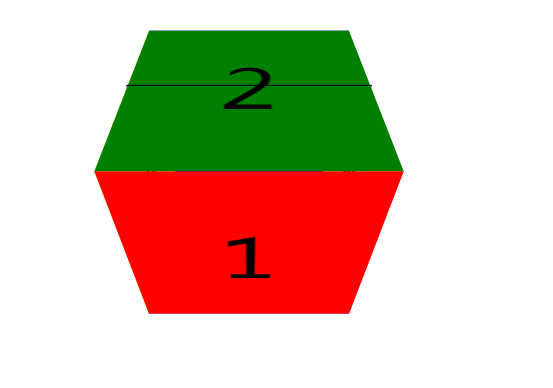
这种写法只要理解了,写起来会更加的方便,而且不不用去考虑转换的角度不对会导致内容是反的,所以推荐这一种写法。当然这种写法在x轴和y轴一起旋转是也会造成内容的反转。
总结
以上就是这篇文章的全部内容了,希望本文的内容对大家的学习或者工作能带来一定的帮助,如果有疑问大家可以留言交流,谢谢大家对考高分网的支持。



