


效果图:
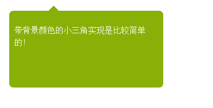
方法一的效果图:
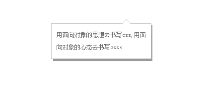
方法二的效果图:
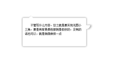
方法三的效果图:
方法1:因为有背景,所有实现起来比较方便,尖角的内部同个颜色就可以不用考虑遮挡问题
html:
带背景颜色的小三角实现是比较简单的!
css
#top {

    position: absolute;
    width: 0px;
    height: 0px;
    line-height: 0px;
    border-bottom: 10px solid #89b007;
    border-left: 10px solid #fff;
    border-right: 10px solid #fff;
    left: 76px;
    top: -10px;
}
#first {
    border-radius:8px;
    -moz-border-radius:8px;-ms-border-radius:8px;-o-border-radius:8px;-webkit-border-radius:8px;
    position: absolute;
    height: 150px;
    width: 300px;
    background: #89b007;
    left: 22px;
    top: 33px;
}
#first p{ padding:10px; line-height:1.5; color:#FFF;}
方法2:
html
    用面向对象的思想去书写css,用面向对象的心态去书写css。
    ◆ ◆
css
* {
margin: 0;
padding: 0;
}
a{ color:#666; text-decoration:none; line-height:25px; text-indent:24px;}
.w{ width:200px; position:absolute; background:#999; left:400px; top:200px; font-size:12px; text-align:left}
.x{ width:180px; position:relative; background:#fff;  border:1px solid #ccc; padding:10px; left:-4px; top:-4px;}
.y , .z{
position: absolute;
left: 141px;
}
.y{
color: #ccc;
font-size: 19px;
top:-12px;
z-index:1;
}
.z{
color: #fff;
font-size: 19px;
top:-11px;  z-index:3;
}
方法3:
不管写什么内容,总之就是要实现无图小三角,要是有背景颜色那倒是极好的,没有的话也可以,就是稍微麻烦一点
#content {
text-indent: 2em;
box-shadow: 0px 0px 10px #999;
padding: 10px;
font-size: 12px;
line-height: 1.5;
border-radius: 5px;
height: 100px;
width: 250px;
position: relative;
margin: 200px auto;
border: 1px solid #CCC;
}
span {
position: absolute;
left: 25px;
height: 0px;
width: 0px;
}

span.out {
line-height: 0;
border-width: 10px;
border-color: transparent transparent #CCC transparent;
border-style: dashed dashed solid dashed;
top: -20px;
}
span.iner {
border-width: 10px;
border-color: #fff transparent #FFF transparent;
border-style: dashed dashed solid dashed;
top: -19px;
line-height: 0;
}

span.right {
background: #FFF;
border-width: 1px;
width: 16px;
height: 16px;
border-color: #CCC #CCC transparent transparent;
border-style: solid solid dashed dashed;
left: 270px;
top: 30px;
border-radius: 0 0 100% 0;
line-height: 0;
box-shadow: 5px 0 10px #aaa;
}
好了,以上所述是小编给大家介绍的CSS实现页面的尖角、小三角、不同方向尖角的方法小结,希望对大家有所帮助。



