


代码和效果图如下:
     .tooltips {
  position: relative;
  width: 300px;
  height: 80px;
  line-height: 60px;
  background: #D7E7FC;
  border-radius: 4px;
     }
     .arrow {
  position: absolute;
  color: #D7E7FC;
  width: 0px;
  height: 0px;
  line-height: 0px;
  border-width: 20px 15px 0;
  border-style: solid dashed dashed dashed;
  border-left-color: transparent;
  border-right-color: transparent;
  bottom: -20px;
  right: 50%;
     }
     .tooltips {
  position: relative;
  width: 300px;
  height: 80px;
  line-height: 60px;
  background: #D7E7FC;
  border: 1px solid #A5C4EC;
  border-radius: 4px;
     }
     .arrow {
  position: absolute;
  width: 0px;
  height: 0px;
  line-height: 0px;
  border-width: 20px 15px 0;
  border-style: solid dashed dashed dashed;
  border-left-color: transparent;
  border-right-color: transparent;
     }
     .arrow-border {
  color: #A5C4EC;
  bottom: -20px;
  right: 50%;
     }
     .arrow-bg {
  color: #D7E7FC;
  bottom: -19px;
  right: 50%;
     }
效果展示图
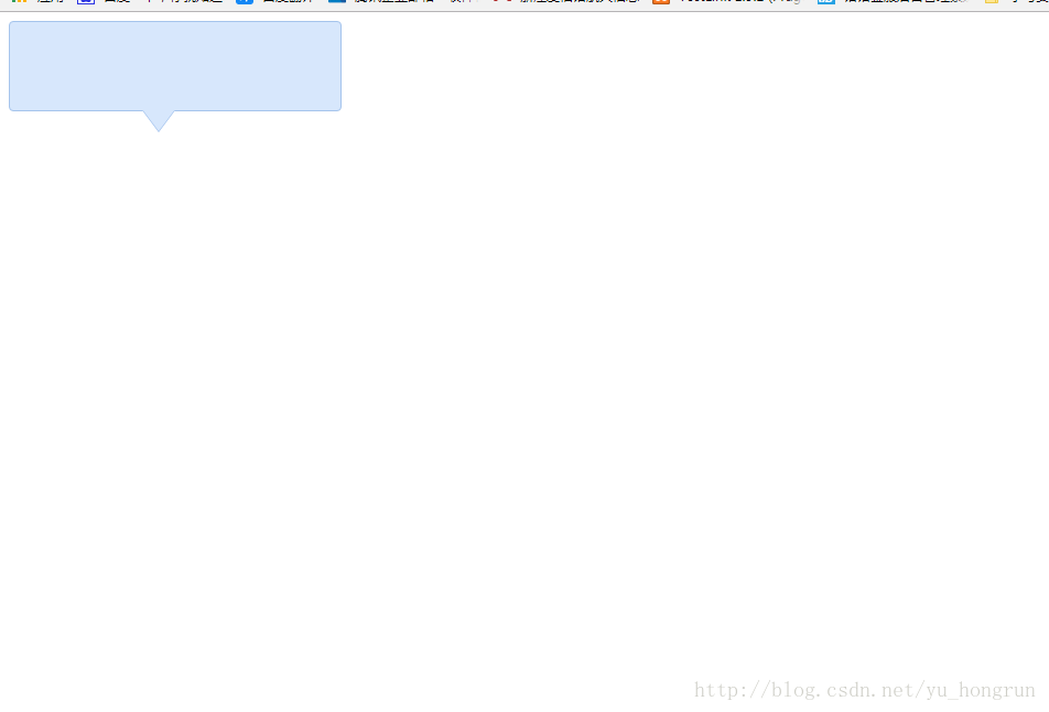
总结
以上所述是小编给大家介绍的 div+css样式自制带小三角的tooltips效果,希望对大家有所帮助,如果大家有任何疑问请给我留言,小编会及时回复大家的。在此也非常感谢大家对考高分网网站的支持!



