


1、工具/原料
- html
- css
2、具体实现
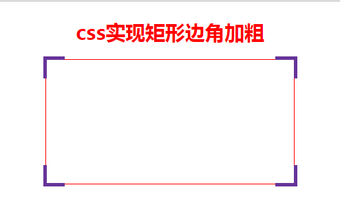
效果图
html代码
css实现矩形边角加粗
css代码
 body{
     display: flex;
     justify-content: center;
     flex-direction: column;
     align-items: center;
 }
 .main{
     position: relative;
     width: 400px;
     height: 200px;
     border: 1px solid red;
 }
 .main span:nth-child(1){
     position: absolute;
     left: -5px;
     top: -5px;
     padding: 15px;
     border-style: solid;
     border-color: rebeccapurple;
     border-width: 5px 0 0 5px;
 }
 .main span:nth-child(2){
     position: absolute;
     right: -5px;
     top: -5px;
     padding: 15px;
     border-style: solid;
     border-color: rebeccapurple;
     border-width: 5px 5px 0 0;
 }
 .main span:nth-child(3){
     position: absolute;
     right: -5px;
     bottom: -5px;
     padding: 15px;
     border-style: solid;
     border-color: rebeccapurple;
     border-width: 0 5px 5px 0;
 }
 .main span:nth-child(4){
     position: absolute;
     left: -5px;
     bottom: -5px;
     padding: 15px;
     border-style: solid;
     border-color: rebeccapurple;
     border-width: 0 0 5px 5px;
 }
原理很简单, 只要弄清position:relative,border和left,top之间的关系就可以了
以上就是本文的全部内容,希望对大家的学习有所帮助,也希望大家多多支持考高分网。



