


近日,很多浏览器按钮点击会出现以下冲击波效果,出于好奇,参考网上的资料,将这个效果研究实现下。

实现思路:
观察波由小变大,涉及的css3属性变化有width,height,left,top,opacity,首先通过伪类实现冲击波层,同时需要设置冲击波前后的中心点位置(这里涉及一点点数学知识:画图计算两个点的位置),最后设置transition-duration: 0实现瞬间变化,ps学习到用a:active可以模拟鼠标实现点击的效果
简单画下图(很菜):
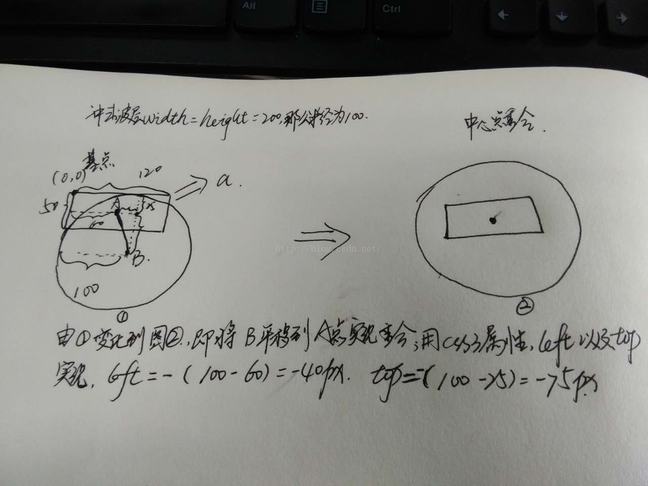
实现的代码:
  实现冲击波--数学知识很重要

  *{
  margin:0;
  padding:0;
  box-sizing:border-box;
  }
  html,body{
  font-family:"微软雅黑";
  }
  .wave{
  position:relative;
  float:left;
  width:50%;
  height:420px;
  }
  .wave a{
  position:absolute;
  top:50%;
  left:50%;
  transform:translate(-50%,-50%);
  display:inline-block;
  width:120px;
  height:50px;

  line-height:50px;
  text-align:center;
  border-radius:5px;
  color:#fff;
  font-size:16px;
  cursor:pointer;


  }
  #wave1{
  background-color:#00BFFF;
  }
  #wave2{
  background-color:#009955;
  }
  #wave1 a{
  background-color:burlywood;
  }
  #wave2 a{
  width:50%;
  height:50px;
  background-color:cadetblue;
  }
  .wave a:after{

  content: "";
  display: block;
  position: absolute;
  left: -40px;
  top: -75px;
  width: 200px;
  height: 200px;
  background: rgba(255,255,255,0.8);
  border-radius: 50%;
  opacity:0;
  transition: all 1s;
  }
  .wave a:active:after{

  width: 0;
  height: 0;
  left:60px;
  top: 25px;
  opacity: 1;
  transition-duration: 0s;
  }

  #wave2 a:after{
  left:50%;
  top:50%;
  transform:translate(-50%,-50%);
  }
  #wave2 a:active:after{
  left:50%;
  top:50%;
  transform:translate(-50%,-50%);
  }


  点我


  点我哈哈
实现的效果:

github代码:实现冲击波代码
备注:2018/01/09更新了考虑按钮长度不确定的情况,同时github代码已经更新
以上就是本文的全部内容,希望对大家的学习有所帮助,也希望大家多多支持考高分网。



