


本文介绍了详解css布局实现左中右布局的5种方式,分享给大家,具体如下:
效果如下:
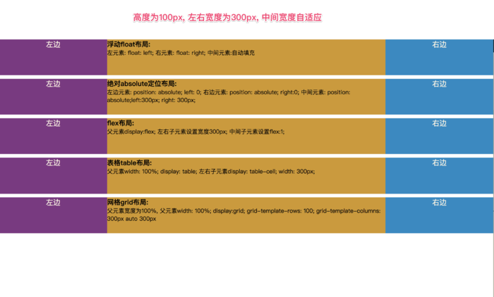
左中右布局
    document

 html *{
     margin: 0;
     padding: 0;
 }

 article{
     height: 100px;
 }
 section{
     margin-top: 10px;
 }

 .left{
     width: 300px;
     height: 100px;
     background-color: #823384;
     text-align: center;
     font-size: 20px;
     color: #fdf6e3;
 }
 .center{
     height: 100px;
     background-color: #d29922;
 }
 .right{
     width: 300px;
     height: 100px;
     background-color: #0c8ac5;
     text-align: center;
     font-size: 20px;
     color: #fdf6e3;
 }


 .float article div{

 }
 .float article .left{
     float: left;
 }
 .float article .right{
     float: right;
 }
 .float article .center{
 }


 左边
 右边

     浮动float布局:
  左元素: float: left; 右元素: float: right; 中间元素:自动填充


 article{
     position: relative;
 }

 .absolute .left-center-right div{
     position: absolute;
 }

 .absolute .left-center-right .left{
     left: 0;
 }

 .absolute .left-center-right .center{

     left: 300px;
     right: 300px;
 }

 .absolute .left-center-right .right{
     right: 0;

 }


 左边

     绝对absolute定位布局:
  左边元素: position: absolute; left: 0;

     右边元素: position: absolute; right:0; 中间元素: position: absolute;left:300px; right: 300px;

 右边


 .flexbox .left-center-right{

     display: flex;

 }
 .flexbox .left-center-right .left{

 }
 .flexbox .left-center-right .center{

     flex:1;
 }

 .flexbox .left-center-right .right{

 }


 左边

     flex布局:
  父元素display:flex; 左右子元素设置宽度300px; 中间子元素设置flex:1;
 右边


 .table-box .left-center-right{
     width: 100%;
     display: table;
 }

 .table-box .left-center-right>div{

     display: table-cell;

 }

 .table-box .left-center-right .left{
 }

 .table-box .left-center-right .center{
 }

 .table-box .left-center-right .right {
 }


 左边

     表格table布局:
  父元素width: 100%; display: table;
     左右子元素display: table-cell; width: 300px;
 右边


 .grid article{
     display: grid;
     width: 100%;
     grid-template-rows: 100px;
     grid-template-columns: 300px auto 300px;
 }


 左边

     网格grid布局:
  父元素宽度为100%,
     父元素width: 100%; display:grid; grid-template-rows: 100; grid-template-columns: 300px auto 300px
 右边
以上就是本文的全部内容,希望对大家的学习有所帮助,也希望大家多多支持考高分网。



