


瀑布流的布局自我感觉还是很吸引人的,最近又看到实现瀑布流这个做法,在这里记录下,特别的,感觉flex布局实现瀑布流还是有点懵的样子,不过现在就可以明白它的原理了
1.multi-column多列布局实现瀑布流
先简单的讲下multi-column相关的部分属性
column-count设置列数column-gap设置列与列之间的间距column-width设置每列的宽度
还要结合在子容器中设置break-inside防止多列布局,分页媒体和多区域上下文中的意外中断
break-inside属性值
- auto 指定既不强制也不禁止元素内的页/列中断。
- avoid 指定避免元素内的分页符。
- avoid-page 指定避免元素内的分页符。
- avoid-column 指定避免元素内的列中断。
- avoid-region 指定避免元素内的区域中断。
截取了部分,可自己填充


牵起你的左手护着你

牵起你的左手护着你

牵起你的左手护着你

牵起你的左手护着你

牵起你的左手护着你
body {
    background: #e5e5e5;
}

#root {
     margin: 0 auto;
     width: 1200px;
     column-count: 5;
     column-width: 240px;
     column-gap: 20px;
}

.item {
     margin-bottom: 10px;

     break-inside: avoid;
     background: #fff;
}
.item:hover {
     box-shadow: 2px 2px 2px rgba(0, 0, 0, .5);
}

.itemImg {
     width: 100%;
     vertical-align: middle;
}

.userInfo {
     padding: 5px 10px;
}
.avatar {
     vertical-align: middle;
     width: 30px;
     height: 30px;
     border-radius: 50%;
}
.username {
     margin-left: 5px;
     text-shadow: 2px 2px 2px rgba(0, 0, 0, .3);
}

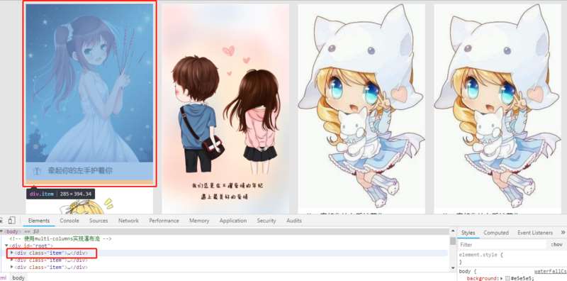
2.flex布局实现瀑布流将外层设置为row布局,然后再设置一个容器并设置为column布局,它是将列作为一个整体,然后在对列进行划分,在列里进行宽固定来实现的
牵起你的左手护着你
牵起你的左手护着你
牵起你的左手护着你
牵起你的左手护着你
牵起你的左手护着你

牵起你的左手护着你

牵起你的左手护着你
牵起你的左手护着你
牵起你的左手护着你
牵起你的左手护着你
牵起你的左手护着你
牵起你的左手护着你
牵起你的左手护着你
body{
   background: #e5e5e5;
}
#root{
    display: flex;
    flex-direction: row;
    margin: 0 auto;
    width: 1200px;
}
.itemContainer{
    margin-right: 10px;
    flex-direction: column;
    width: 240px;
}
.item{
   margin-bottom: 10px;
   background: #fff;
}
.itemImg{
   width: 100%;
}
.userInfo {
   padding: 5px 10px;
}
.avatar {
   vertical-align: middle;
   width: 30px;
   height: 30px;
   border-radius: 50%;
}
.username {
   margin-left: 5px;
   text-shadow: 2px 2px 2px rgba(0, 0, 0, .3);
}

实践后发现,纯css实现的瀑布流只能是一列一列的排布,所以还是得用js来实现瀑布流更符合我们常见的瀑布流
以上就是本文的全部内容,希望对大家的学习有所帮助,也希望大家多多支持考高分网。



