


1、过渡 transition
过渡属性用法: transition :ransition-property transition-duration transition-timing-function transition-delay
可以一起指定也可以分别单独指定
transition-property: 是要过渡的属性(如width,height),all是所有都改变。
transition-duration:花费的时间,单位为s或ms
transition-timing-function:是指定动画类型(运动区曲线),运动曲线有以下几种
ease=>逐渐慢下来(默认值) linear=>匀速 ease-in=>加速 ease-out=>减速 ease-in-out=>先加速在减速
transition-delay 延迟时间,单位为s或ms
    document


 div {
     width: 100px;
     height: 200px;
     background-color: aqua;
     transition: width 2s ease-in-out 0.5s;
 }

 div:hover {
     width: 500px;
 }
结果如下,当鼠标上上去后变化不再是瞬间完成,而是过渡完成。

2、变形 transform
(1)、2D变形
(a)移动 translate(x,y)
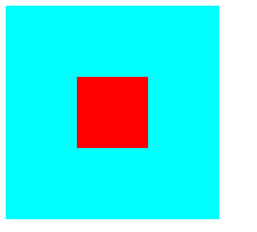
移动可以指定像素值也可以指定百分比, 注意:指定百分比是自身大小的百分比,因此可以用于设置盒子定位时的居中对齐(在设置left:50%后再移动自身的-50%即可)。
    document

 div {
     width: 100px;
     height: 100px;
     background-color: aqua;
     transition: all 2s;
 }

 div:active {
     transform: translate(200px, 200px);
 }
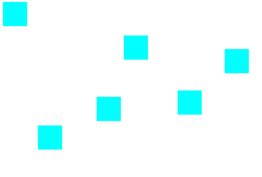
点击之后盒子进行了移动。用于让定位的盒子居中的代码入下
    document

 .fa {
     width: 300px;
     height: 300px;
     background-color: aqua;
     transition: all 0.5s;
     position: relative;
 }

 .son {
     background-color: red;
     position: absolute;
     left: 50%;
     top: 50%;
     width: 100px;
     height: 100px;
     transform: translate(-50%, -50%);
 }
结果为
(b)缩放 scale(x,y)
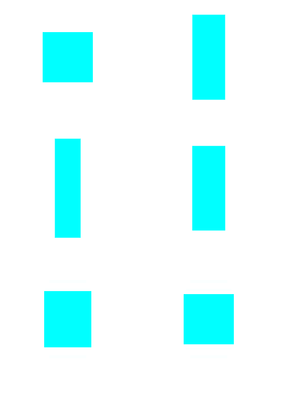
x,y设置大于1 是放大,小于1 是缩小。
    document

 div {
     width: 100px;
     height: 100px;
     background-color: aqua;
     margin: 200px auto;
     transition: all 2s;
 }

 div:hover {
     transform: scale(0.5, 2);
 }
(c)旋转 rotate(x deg)
x指定度数值,正数是顺时针旋转,负数是逆时针旋转。
旋转可以使用 transform-origin 指定旋转中心点,transform-origin 给left top right bottom 也可以指定具体的像素值。
    document

 div {
     width: 200px;
     height: 100px;
     background-color: aqua;
     margin: 200px auto;
     transition: all 2s;
     transform-origin: bottom left;
 }

 div:hover {
     transform: rotate(120deg);
 }

(d)倾斜 skew(x deg ,y deg)
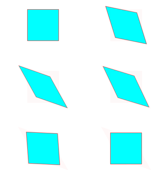
x,y分别指定倾斜在x,y方向上的角度,可以为负数。y值不写默认为0。
    document

 div {
     width: 100px;
     height: 100px;
     background-color: aqua;
     border: 1px solid red;
     transition: all 1s;
     margin: 200px auto;
 }

 div:hover {
     transform: skew(30deg, 20deg);
 }
(2)3D变形
(a)旋转(rotateX,rotateY,rotateZ)
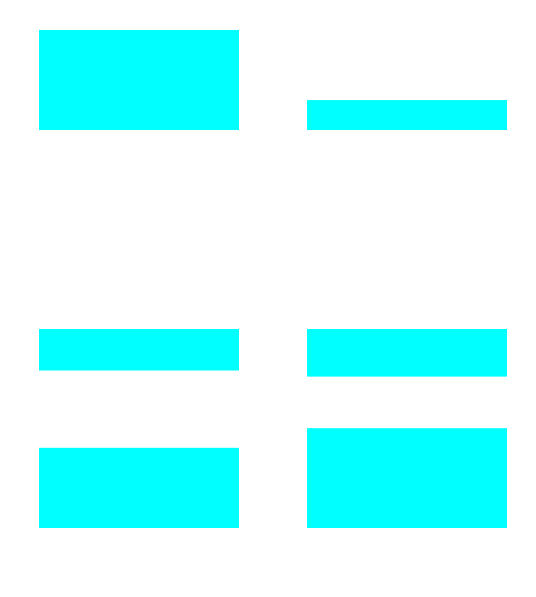
3D旋转与2D类似,只不过一个是基于二位坐标一个是基于三维坐标。三个值可以同时指定也可以单独指定。
    document

 div {
     width: 200px;
     height: 100px;
     background-color: aqua;
     margin: 200px auto;
     transition: all 2s;
     transform-origin: bottom left;
 }

 div:hover {
     transform: rotateX(120deg);


 }
(b)移动(translateX,translateY,translateZ)
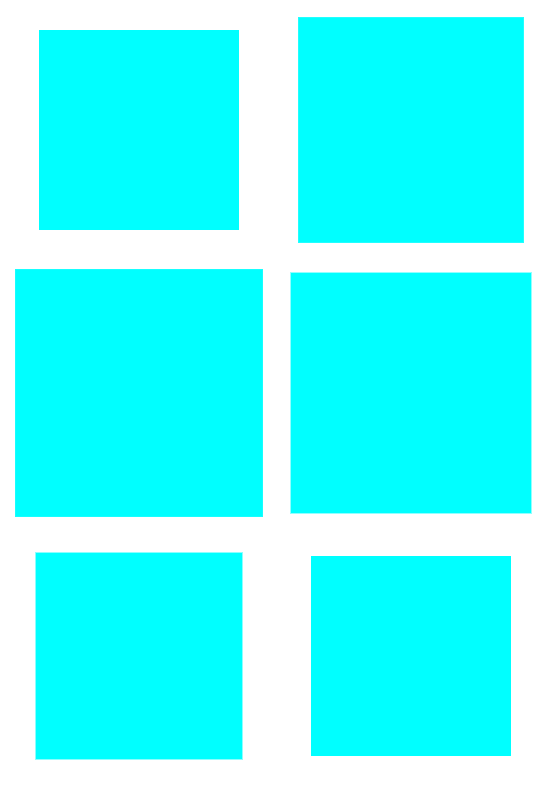
3D移动对于xy方向上的移动与2d移动一致。只有z方向上的移动不一样。Z方向上的移动在现实生活中是距离变远,距离变近。因此在网页中显示结果是变近则变大,变远则变小。
要使Z放线上移动生效首先要设置perspective(眼睛距离屏幕的距离);
    document

 body {
     perspective: 1000px;

 }

 div {
     width: 200px;
     height: 200px;
     background-color: aqua;
     transition: all 0.5s;
     margin: 200px auto;
 }

 div:hover {
     transform: translate3d(0, 0, 200px);
 }
3、动画 animation
(1)、 animation: animation- name || animation- duration|| animation- timing-function || animation- delay || animation- iteration-count|| animation- direction|| animation- fill-mode;
animation-name:动画名称(自己使用@keyframes 定义的动画)
animation-duration:持续时间
animation-timing-function:运动曲线,与过渡的运动曲线类似。
animation-delay:延迟时间
animation-iteration-count:循环次数 (infinite 是无限循环)
animation-direction:是否反向(动画是否是由结尾倒开是倒着放的)
animation-fill-mode:设置在动画播放之外的状态(结束时的状态)none | forwards(设为结束时的状态)| backwards(设为开始时的状态)|both(设为开始或结束时的状态)
animation-play-state:设置动画状态 running 开始|paused 暂停
(2)、@keyframes 自定义动画
格式如下
@keyframes 动画名称 {
from{ 开始} 0%
to{ 结束 } 100%
}
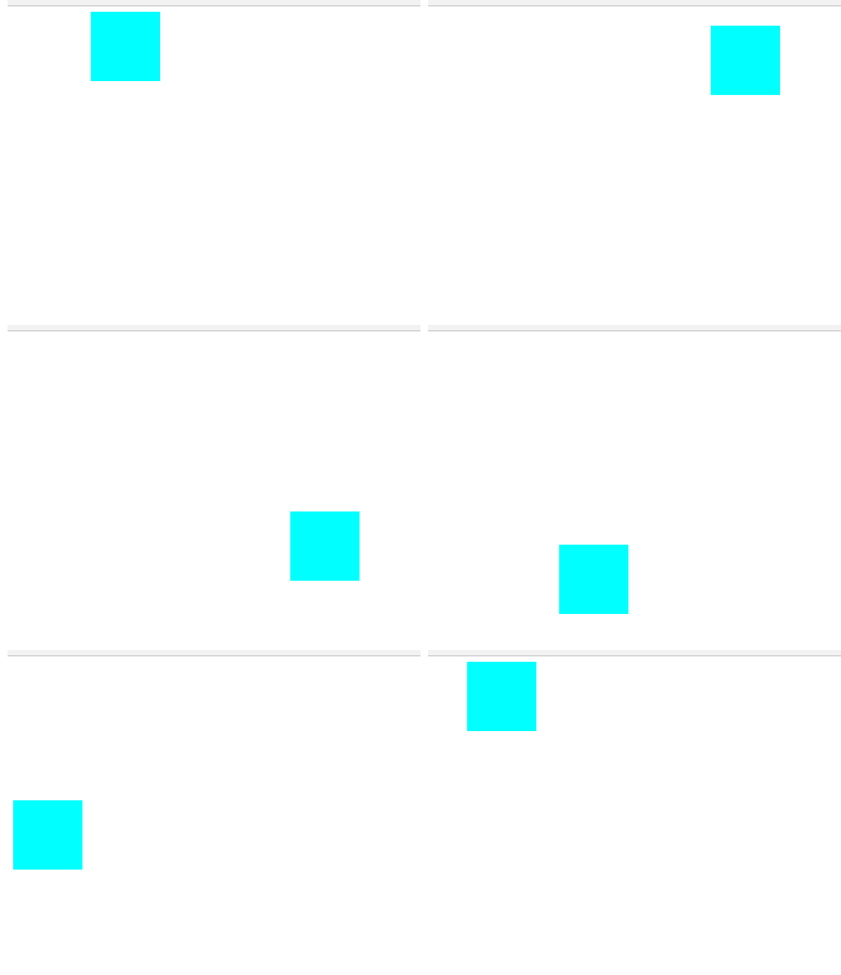
可以用 from...to 来指定动画过程,也可以用0%~100%指定动画过程。
    document

 div {
     width: 100px;
     height: 100px;
     background-color: aqua;

     animation: move 5s linear 3;
 }

 @keyframes move {
     0% {
  transform: translate3d(0, 0, 0);
     }
     25% {
  transform: translate3d(400px, 0, 0);
     }
     50% {
  transform: translate3d(400px, 300px, 0);
     }
     75% {
  transform: translate3d(0, 300px, 0);
     }
     100% {
  transform: translate3d(0, 0, 0);
     }
 }
以上就是本文的全部内容,希望对大家的学习有所帮助,也希望大家多多支持考高分网。



