


emmm 名字瞎想的2333
前言
这是一个用来练习的css demo,如果有哪里写的不好,还请各位指正,一定虚心接受。嘻嘻
HTML布局
CSS 样式
主要使用了动画效果,通过不断控制元素的角度位置实现一个类似于吃豆人一样的loading demo。
    body {
      margin: 0;
      padding: 0;
      background: #fff;
    }
    .container {
      position: absolute;
      top: 50%;
      left: 50%;
      transform: translate(-50%, -50%);
    }
    .loading {
      position: relative;
      width: 200px;
      height: 50px;
      display: flex;
    }
    .eat {
      position: relative;
      width: 50px;
      height: 50px;
      left: 0;
      color: #ff0000;
      animation: eat-animate 2.4s ease-in-out infinite;
    }
    @keyframes eat-animate {
      100% {
 left: 150px;
      }
    }
    .eat::before {
      content: '';
      position: absolute;
      width: 0;
      height: 0;
      width: 50px;
      height: 25px;
      top: 0;
      border-radius: 50px 50px 0 0;
      background: currentColor;
      transform: rotate(-30deg);
      animation: eat-top 2.4s ease-in-out infinite;
    }
    @keyframes eat-top {
      20% {
 transform: rotate(-30deg);
      }
      35% {
 transform: rotate(0deg);
      }
      45% {
 transform: rotate(-30deg);
      }
      60% {
 transform: rotate(0deg);
      }
      70% {
 transform: rotate(-30deg);
      }
      85% {
 transform: rotate(0deg);
      }
      100% {
 transform: rotate(0deg);
      }
    }
    .eat::after {
      content: '';
      position: absolute;
      width: 0;
      height: 0;
      width: 50px;
      height: 25px;
      bottom: 0;
      border-radius: 0 0 50px 50px;
      background: currentColor;
      transform: rotate(30deg);
      animation: eat-bottom 2.4s ease-in-out infinite;
    }
    @keyframes eat-bottom {
      20% {
 transform: rotate(30deg);
      }
      35% {
 transform: rotate(0deg);
      }
      45% {
 transform: rotate(30deg);
      }
      60% {
 transform: rotate(0deg);
      }
      70% {
 transform: rotate(30deg);
      }
      85% {
 transform: rotate(0deg);
      }
      100% {
 transform: rotate(0deg);
      }
    }
    .load {
      position: relative;
      width:30px;
      height: 30px;
      margin: 10px;
      color: #e47272;
      border-radius: 50%;
      background: currentColor;
    }
    .load:nth-child(2) {
      animation: load1 2.4s linear infinite;
      transform: scale(1);
    }
    @keyframes load1 {
      35% {
 transform: scale(0);
      }
      100% {
 transform: scale(0);
      }
    }
    .load:nth-child(3) {
      animation: load2 2.4s linear infinite;
      transform: scale(1);
    }
    @keyframes load2 {
      30% {
 transform: scale(1);
      }
      58% {
 transform: scale(0);
      }
      100% {
 transform: scale(0);
      }
    }
    .load:nth-child(4) {
      animation: load3 2.4s linear infinite;
      transform: scale(1);
    }
    @keyframes load3 {
      60% {
 transform: scale(1);
      }
      80% {
 transform: scale(0);
      }
      100% {
 transform: scale(0);
      }
    }
Preview
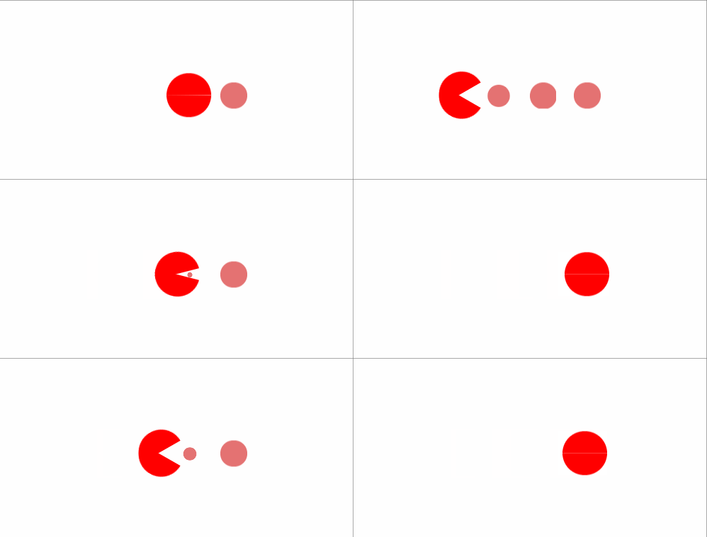
整体如上所示,如果有看不懂的也欢迎直接回复...
目前持续更新中 https://github.com/ajycc20/easy-css-layout ,欢迎大佬们提出意见!!!
以及,有个star会更好啊 ( hhhh 逃
以上就是本文的全部内容,希望对大家的学习有所帮助,也希望大家多多支持考高分网。



