


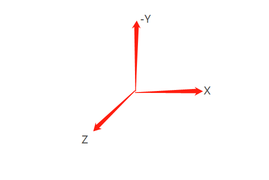
- 当元素进行旋转时,他的坐标轴也跟着他进行旋转
- 注意-y方向问题
旋转立方体的效果
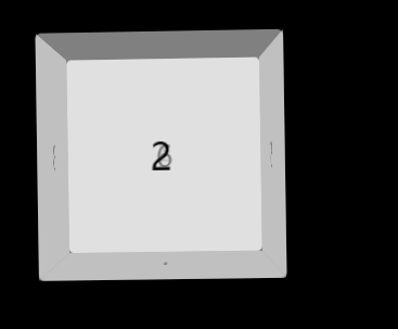
分析
- 一个容器包含6个div
- position:absolute 之后6个面完全重合
- 通过trandform:rotateX/Y/Z(),translateX/Y/Z()调整到相应位置
- 添加transition动画效果
- 注意这里面的旋转是绕着他的中心线进行旋转的所以唯一100px
- 他在旋转时,他的坐标轴也是跟着他进行旋转的(这很重要)
代码
    document

 *{
     margin: 0px;
     padding: 0px;

 }
 body{
     perspective: 800px;
     background: #000000;
 }
 #container{
     height: 200px;
     width: 200px;
     margin: 100px auto 0;
     position: relative;
     transform-style: preserve-3d;
     animation: move 1s ease infinite;

 }
 @keyframes move{
     from{
  transform: rotateY(0deg) rotateZ(0deg);
     }
     to{
  transform: rotateY(360deg) rotateZ(360deg);
     }

 }
 #container>div{
     height: 100%;
     width: 100%;
     border-radius: 5px;
     background: rgba(255,255,255,0.5);
     position: absolute;
     left: 0px;
     right: 0px;
     text-align: center;
     line-height: 200px;
     font-size: 30px;
 }
 #one{
     transform:rotateX(-90deg) translateZ(100px);
 }
 #two{
     transform:translateZ(100px) ;
 }
 #three{
     transform: rotateY(-90deg) translateZ(100px);
 }
 #four{
     transform: rotateY(-180deg) translateZ(100px);
 }
 #five{
     transform: rotateY(90deg) translateZ(100px);
 }
 #six{
     transform: translateZ(-100px);
 }


 1
 2
 3
 4
 5
 6
以上就是本文的全部内容,希望对大家的学习有所帮助,也希望大家多多支持考高分网。



