


animation-name 动画名称,可以有多个值,用逗号隔开,表示绑定了多个动画
animation-name属性为动画指定一个名称
animation-name兼容主流的浏览器,不过还是需要加前缀去兼容
animation-name有两个属性值,分别是keyframename和none
document

    body{
 margin:0 auto;
 background:#abcdef;
    }
    div{
 width:800px;
 height:800px;
 margin:0 auto;
    }
    .container{
 position: relative;
    }
    .inner, .middle, .outer, .pic{
 position: absolute;
 top:0;
 right:0;
 bottom:0;
 left:0;
 margin:auto;
    }
    .inner{
 background:url(source/circle_inner.jpg) center no-repeat;
 animation-name:circle_inner;
    }
    .middle{
 background:url(source/circle_middle.jpg) center no-repeat;
 animation-name:circle_middle;
    }
    .outer{
 background:url(source/circle_outer.jpg) center no-repeat;
 animation-name:circle_outer;
    }
    .pic{
 background:url(source/pic.jpg) center no-repeat;
    }
animation-duration 动画持续时间 默认是0
animation-timing-function 动画时间函数
animation-delay 动画延迟时间
animation-delay 属性定义动画什么时候开始,单位可以是秒(s)或毫秒(ms),允许负值,-2s使动画马上开始,但会跳过2s进入动画
animation-iteration-count 动画循环次数
animation-iteration-count: number | infinite 默认为1
animation-direction: normal | reverse | alternate | alternate-reverse 正常; 反向; 正反交替; 反正交替
alternate 和 alternate-reverse ,如果animation-itreation-count 不是设置成 infinite ,则只会执行一次就停止
animation-fill-mode 动画延迟未执行时,或者动画执行完毕后的停留状态(动画不能设置为循环,否则无法停止)
animation-fill-mode: none | forwards | backwards | both 无 结束状态 开始状态 看情况
animation-play-state: running | paused 动画运行状态:运行 | 暂停
animation 简写
animation: name duration timing-function delay iteration-count direction fill-mode play-state
document

    body{
 margin:0 auto;
 background:#abcdef;
    }
    div{
 width:800px;
 height:800px;
 margin:0 auto;
    }
    .container{
 position: relative;
 -webkit-transform-style:preserve-3d;
    -moz-transform-style:preserve-3d;
     -ms-transform-style:preserve-3d;
      -o-transform-style:preserve-3d;
  transform-style:preserve-3d;
    }
    .inner, .middle, .outer, .pic{
 position: absolute;
 top:0;
 right:0;
 bottom:0;
 left:0;
 margin:auto;
    }
    .container:hover div{
 -webkit-animation-play-state:paused;
    -moz-animation-play-state:paused;
     -ms-animation-play-state:paused;
      -o-animation-play-state:paused;
  animation-play-state:paused;
    }
    .inner{
 background:url(source/circle_inner.jpg) center no-repeat;

 -webkit-animation:circle_inner 10s ease-in-out 1s infinite alternate running;
    -moz-animation:circle_inner 10s ease-in-out 1s infinite alternate running;
     -ms-animation:circle_inner 10s ease-in-out 1s infinite alternate running;
      -o-animation:circle_inner 10s ease-in-out 1s infinite alternate running;
  animation:circle_inner 10s ease-in-out 1s infinite alternate running;


    }
    .middle{
 background:url(source/circle_middle.jpg) center no-repeat;
 -webkit-animation:circle_middle 10s ease-in-out 1s infinite alternate running;
    -moz-animation:circle_middle 10s ease-in-out 1s infinite alternate running;
     -ms-animation:circle_middle 10s ease-in-out 1s infinite alternate running;
      -o-animation:circle_middle 10s ease-in-out 1s infinite alternate running;
  animation:circle_middle 10s ease-in-out 1s infinite alternate running;
    }
    .outer{
 background:url(source/circle_outer.jpg) center no-repeat;
 -webkit-animation:circle_outer 10s ease-in-out 1s infinite alternate running;
    -moz-animation:circle_outer 10s ease-in-out 1s infinite alternate running;
     -ms-animation:circle_outer 10s ease-in-out 1s infinite alternate running;
      -o-animation:circle_outer 10s ease-in-out 1s infinite alternate running;
  animation:circle_outer 10s ease-in-out 1s infinite alternate running;
    }
    .pic{
 background:url(source/pic.jpg) center no-repeat;
    }
    @keyframes circle_inner{
 0%{ transform:rotateX(0deg); }
 50%{ transform:rotateX(90deg); }
 100%{ transform:rotateX(360deg); }
    }
    @keyframes circle_middle{
 0%{ transform:rotateY(0deg); }
 50%{ transform:rotateY(90deg); }
 100%{ transform:rotateY(360deg); }
    }
    @keyframes circle_outer{
 0%{ transform:rotateZ(0deg); }
 50%{ transform:rotateZ(90deg); }
 100%{ transform:rotateZ(360deg); }
    }
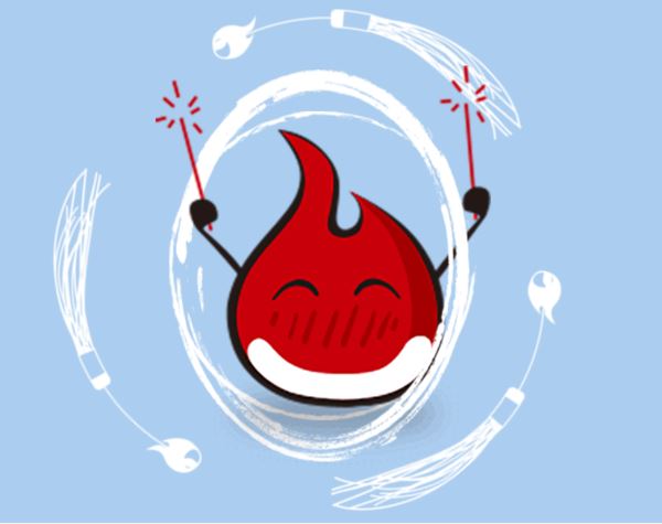
动画性能优化:
用position-fixed代替background-attachment
带图片的元素放在伪元素中
will-change
兼容性IE13+ 感觉可以放弃了……
向下提示箭头效果
document

    body{
 margin:0 auto;
 background:#abcdef;
    }
    div{
 width:30px;
 height:30px;
 position: fixed;
 left:0;
 right:0;
 bottom:100px;
 margin:0 auto;
 cursor:pointer;
 -webkit-transform:rotate(90deg);
    -moz-transform:rotate(90deg);
     -ms-transform:rotate(90deg);
      -o-transform:rotate(90deg);
  transform:rotate(90deg);
 -webkit-animation:upDown 2s ease-in-out infinite;
   -moz-animation:upDown 2s ease-in-out infinite;
    -ms-animation:upDown 2s ease-in-out infinite;
     -o-animation:upDown 2s ease-in-out infinite;
 animation:upDown 2s ease-in-out infinite;
    }
    @-webkit-keyframes upDown{
 0%{ bottom:100px; }
 50%{ bottom:80px; }
 100%{ bottom:100px; }
    }
    @-moz-keyframes upDown{
 0%{ bottom:100px; }
 50%{ bottom:80px; }
 100%{ bottom:100px; }
    }
    @-ms-keyframes upDown{
 0%{ bottom:100px; }
 50%{ bottom:80px; }
 100%{ bottom:100px; }
    }
    @-o-keyframes upDown{
 0%{ bottom:100px; }
 50%{ bottom:80px; }
 100%{ bottom:100px; }
    }
    @keyframes upDown{
 0%{ bottom:100px; }
 50%{ bottom:80px; }
 100%{ bottom:100px; }
    }


    >
总结
以上所述是小编给大家介绍的css3使用animation属性实现炫酷效果,希望对大家有所帮助!



