


在web项目中我们经常要使用时间轴(timeline)控件。本文提供一种基于CSS3的可逐项展开的timeline,在各展开项中可以嵌入文本、图片、视频等元素。运行效果如下:

实现
该控件的实现过程较为简单,主要由test.html文件和timeline.css文件组成。具体代码如下:
1、test.html文件
Timeline
-
T1
长安元年(701年),李白,字太白。其生地今一般认为是唐剑南道绵州(巴西郡)昌隆(后避玄宗讳改为昌明)青莲乡。祖籍为甘肃天水。 其家世、家族皆不详。据《新唐书》记载,李白为兴圣皇帝(凉武昭王李暠)九世孙,按照这个说法李白与李唐诸王同宗,是唐太宗李世民的同辈族弟。 亦有说其祖是李建成或李元吉。
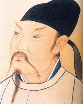
-
T2
神龙元年(705年), 十一月,武则天去世。李白五岁。发蒙读书始于是年。 《上安州裴长史书》云:“五岁诵六甲。”六甲,唐代的小学识字课本,长史,州之次官。
-
T3
开元三年(715年),李白十五岁。 已有诗赋多首,并得到一些社会名流的推崇与奖掖,开始从事社会干谒活动。 亦开始接受道家思想的影响,好剑术,喜任侠。是年岑参生。
-
T4
开元六年(718年),李白十八岁。 隐居戴天大匡山(在今四川省江油市内)读书。 往来于旁郡,先后出游江油、剑阁、梓州(州治在今四川省境内)等地,增长了不少阅历与见识。
2、timeline.css文件
#timeDiv{
    max-width: 1200px;
    margin: 0 auto;
    padding: 0 5%;
    font-size: 100%;
    font-family: "Noto Sans", sans-serif;
    color: black;
    background: white;
}

#timeline {
list-style: none;
margin: 50px 0 30px 120px;
padding-left: 30px;
border-left: 8px solid gray;
}
#timeline li {
margin: 40px 0;
position: relative;
}
#timeline p {
margin: 0 0 15px;
}

.date {
margin-top: -10px;
top: 50%;
left: -80px;
font-size: 0.95em;
line-height: 20px;
position: absolute;
}

.circle {
margin-top: -15px;
top: 50%;
left: -49px;
width: 20px;
height: 20px;
background: white;
border: 5px solid gray;
border-radius: 50%;
display: block;
position: absolute;
}

.content {
max-height: 20px;
padding: 70px 20px 0;
border-color: transparent;
border-width: 2px;
border-style: solid;
border-radius: 0.5em;
position: relative;
}
.content:before, .content:after {
content: "";
width: 0;
height: 0;
border: solid transparent;
position: absolute;
pointer-events: none;
right: 100%;
}
.content:before {
border-right-color: inherit;
border-width: 20px;
top: 50%;
margin-top: -20px;
}
.content:after {
border-right-color: white;
border-width: 17px;
top: 50%;
margin-top: -17px;
}
.content p {
max-height: 0;
color: transparent;
text-align: justify;
word-break: break-word;
hyphens: auto;
overflow: hidden;
}
label {
font-size: 1.3em;
position: absolute;
z-index: 100;
cursor: pointer;
top: 35px;
transition: transform 0.2s linear;
font-weight: bold;
}

.radio {
display: none;
}

.radio:checked + .relative label {
cursor: auto;
transform: translateX(42px);
}
.radio:checked + .relative .circle {
background: red;
}
.radio:checked ~ .content {
max-height: 200000px;
border-color: lightgray;
margin-right: 20px;
transform: translateX(20px);
transition: max-height 0.4s linear, border-color 0.5s linear, transform 0.2s linear;
}
.radio:checked ~ .content p {
max-height: 200000px;
color: black;
transition: color 0.3s linear 0.3s;
}

@media screen and (max-width: 767px) {
#timeline {
  margin-left: 0;
  padding-left: 0;
  border-left: none;
}
#timeline li {
  margin: 50px 0;
}

label {
  width: 85%;
  font-size: 1.1em;
  white-space: nowrap;
  text-overflow: ellipsis;
  overflow: hidden;
  display: block;
  transform: translateX(18px);
}

.content {
  padding-top: 60px;
  border-color: #eee9dc;
}
.content:before, .content:after {
  border: solid transparent;
  bottom: 100%;
}
.content:before {
  border-bottom-color: inherit;
  border-width: 17px;
  top: -16px;
  left: 50px;
  margin-left: -17px;
}
.content:after {
  border-bottom-color: white;
  border-width: 20px;
  top: -20px;
  left: 50px;
  margin-left: -20px;
}
.content p {
  font-size: 0.9em;
  line-height: 1.4;
}

.circle, .date {
  display: none;
}
}
【参考文献】 CSS3 TIMELINE
到此这篇关于基于ccs3的timeline时间线实现方法的文章就介绍到这了,更多相关css3 timeline实现内容请搜索考高分网以前的文章或继续浏览下面的相关文章,希望大家以后多多支持考高分网!



