


话不多说,先来看一下效果图
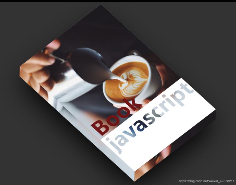
源代码如下
    document


    *{
 margin: 0;
 padding: 0;
    }
    body{
 display: flex;
 align-items: center;
 justify-content: center;
 width: 100%;
 min-height: 100vh;
 background: #333333;
 background-size: cover;
    }
    .book{
 width: 400px;
 height: 600px;
 position: relative;
 background-color: #ffffff;
 transform: rotate(-37.5deg) skewX(10deg);
 box-shadow: -35px 35px 50px rgb(0,0, 0, 1);
 transition: 0.5s;

 cursor: pointer;
    }
    .book:hover{


 transform: rotate(-37.5deg) skewX(10deg) translate(20px,-20px);

 box-shadow: -50px 50px 100px rgba(0,0,0,1);
    }

    .book::before{
 content:'';
 height:100%;
 width:30px;
 background: red;
 position: absolute;
 top: 0;
 left: 0;
 transform: skewY(-45deg) translate(-30px,-15px);
 box-shadow: inset -10px 0 20px raba(0,0,0,0,2);
 background: url(cofe.jpg);
    }
    .book::after{
     content: '';
     height: 30px;
     width: 100%;
     background: #fff;
     position: absolute;
     bottom: 0;
     left: 0;
     transform: skewX(-45deg) translate(15px,30px);
     background: url(cofe.jpg);

    }
    .book h2{
 position: absolute;
 bottom: 100px;
 left: 10px;
 font-size: 5em;
 line-height: 1em;
 color: rgb(110, 21, 21);
    }
    .book h2 span{
 background-image: url(cofe.jpg);
 background-attachment: fixed;
 -webkit-background-clip: text;
 -webkit-text-fill-color: transparent;
    }
    .book .write i{
 font-weight: 700;
    }
    .book .cover{
 position: absolute;
 top: 0;
 left: 0;
 width: 100%;
 height: 70%;
 background-image: url(cofe.jpg);
 background-size: cover;
    }


 Book javascript
  written by fans
总结
到此这篇关于CSS实现3D书本效果的文章就介绍到这了,更多相关css 3D书本内容请搜索考高分网以前的文章或继续浏览下面的相关文章,希望大家以后多多支持考高分网!



