


用css3动画实现的一个简单炫酷效果,最终的效果图如下:
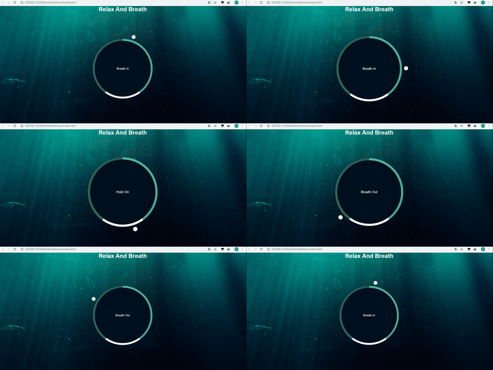
页面结构(index.html):
  document


  Relax And Breath
script.js:
const container = document.querySelector('.container');
const text = document.querySelector('#text');

const totalTime = 7500;
const breathTime = (totalTime/5)*2; //呼吸的时间为3s
const holdTime = totalTime/5;    //保持呼吸的时间为1.5s
console.log(breathTime);

breathAnimation();    //一开始自执行breathAnimation函数
function breathAnimation(){
  text.innerHTML = 'Breath In';
  container.className = 'container grow';    //给container添加grow类,实现放大效果

  setTimeout(function(){
    text.innerHTML = 'Hold On';
    setTimeout(function(){
      text.innerHTML = 'Breath Out';
      container.className = 'container shrink';//给container添加shrink类,实现缩小效果
    },holdTime)
  },breathTime)
}

setInterval(breathAnimation,totalTime);    //重复执行
样式(style.css):
*{
  margin: 0;
  padding: 0;
  box-sizing: border-box;
}

body{
  background: url('./img/bg.jpg') no-repeat center center /cover;
  min-height: 100vh;
  font-family: Arial, Helvetica, sans-serif;
  color: #fff;
  overflow: hidden;
  display: flex;
  flex-direction: column;
  align-items: center;
  justify-content: center;
}

.container{
  position: relative;
  width: 300px;
  height: 300px;
  display: flex;
  align-items: center;
  justify-content: center;
  transform: scale(1);
  margin: auto;
}


.gradient-circle{
  position: absolute;
  left: -10px;
  top: -10px;
  background: conic-gradient(
    #55b7a4 0%,
    #4ca493 40%,
    #fff 40%,
    #fff 60%,
    #336d62 60%,
    #2a5b52 100%
  );
  width: 320px;
  height: 320px;
  border-radius: 50%;
  z-index: -2;
}

/z-index为-1,为中间黑色的圆/
.circle{
  position: absolute;
  left: 0;
  top: 0;
  width: 300px;
  height: 300px;
  background-color: #010f1c;
  border-radius: 50%;
  z-index: -1;
}


.pointer-container{
  position: absolute;
  width: 20px;
  height: 190px;
  top: -40px;
  left: 140px;

  transform-origin: bottom center;
  animation: rotate 7.5s linear forwards infinite;
}


.pointer{
  width: 20px;
  height: 20px;
  background-color: #fff;
  border-radius: 50%;
}


@keyframes rotate{
  from{
    transform: rotate(0deg);
  }to{
    transform: rotate(360deg);
  }
}
.container.grow{
  animation: grow 3s linear forwards;
}
.container.shrink{
  animation: shrink 2s linear forwards;
}
@keyframes grow{
  from{
    transform: scale(1)
  }to{
    transform: scale(1.2);
  }
}

@keyframes shrink{
  from{
    transform: scale(1.2)
  }to{
    transform: scale(1);
  }
}
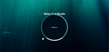
如果.container的margin不设置为auto或者一个具体的值,就会造成下图的效果,文字和圆挤在一块:
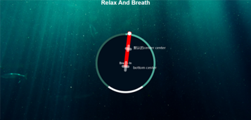
同时我把.pointer-container里面的 background-color: red; 添上就会更加理解为什么要把.pointer-container的高度设置为190px.另外如果不把transform-origin设置为bottom center它就会如图中标注的默认点旋转,这并不是我们想要的效果.
还有个细节就是.shrink的动画时间我设置成了两秒,其实按照js里面的breath out这段时间应该为3s,但是为了从breath out到breath in有个缓冲的效果,就设置成了2s,不然breath out到breath in没有一个过渡,会显得突兀不好看.
到此这篇关于CSS3+Javascript实现炫酷呼吸效果的示例代码的文章就介绍到这了,更多相关CSS3+Javascript呼吸效果内容请搜索考高分网以前的文章或继续浏览下面的相关文章,希望大家以后多多支持考高分网!



