


最近打开电脑就能看到极客学院什么新用户vip免费一个月,就进去看看咯,这里就不说它的课程怎么滴了,里面实战路径图页面看到了这个效果:

有点像时间轴的赶脚,而且每一块鼠标悬浮上去也有下拉效果展开介绍截图信息,就感觉效果还不错。但感觉这种效果貌似对于动态添加不是很灵活,因为高度不像宽度可以灵活的自适应,故添加得自己一个一个设置。所以很多都是做成展示效果。
当然啦,自己也基于它的这个想法搞了一点简单点的类似效果,主要还是整个布局效果,具体每一块内容就不仿造了,而且我自己也加了一下开场动画,让它更好玩一些…
先来看看效果吧:
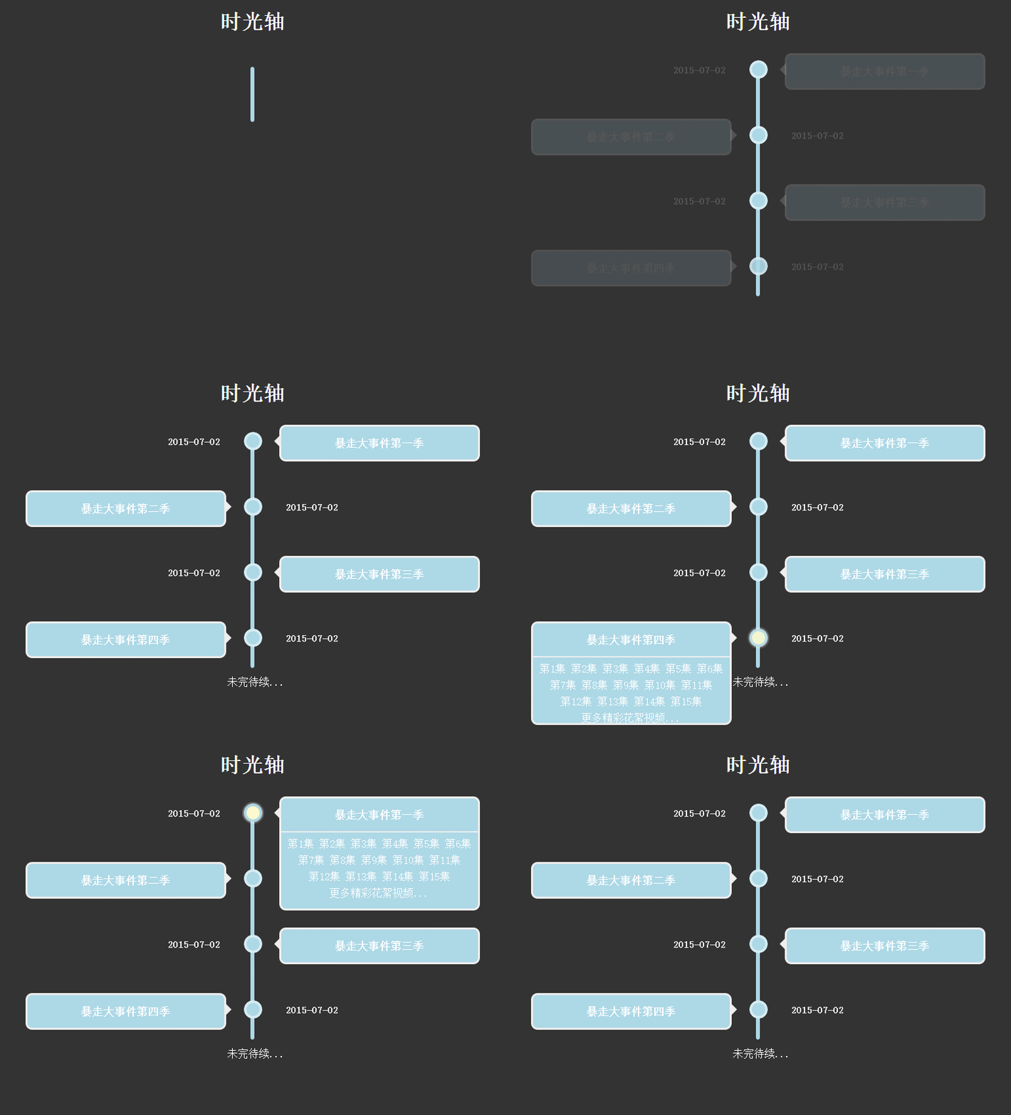
大概效果就是这样啦,下来废话不说,还是直接进入主题:
HTML结构:
  2015-07-02

      暴走大事件第一季
暴走大事件第二季
这里简化了一下HTML结构,.time类表示在右边,.timeLeft表示在左边,然后加点上外边距就可以了,每一块里面的内容我就删减掉了。
CSS样式代码如下:
body{
  background: #333;
     }
     h1{
  text-align: center;
  color:#fff;
     }
     .timezone{
  width:6px;
  height: 350px;
  background: lightblue;
  margin: 0 auto;
  margin-top:50px;
  border-radius: 3px;
  position: relative;
  -webkit-animation: heightSlide 2s linear;
     }
     @-webkit-keyframes heightSlide{
  0%{
      height: 0;
  }
  100%{
      height: 350px;
  }
     }
     .timezone:after{
  content: '未完待续...';
  width: 100px;
  color:#fff;
  position: absolute;
  margin-left: -35px;
  bottom: -30px;
  -webkit-animation: showIn 4s ease;
     }
     .timezone .time,.timezone .timeLeft{
  position: absolute;
  margin-left: -10px;
  margin-top:-10px;
  width:20px;
  height:20px;
  border-radius: 50%;
  border:4px solid rgba(255,255,255,0.5);
  background: lightblue;
  -webkit-transition: all 0.5s;
  -webkit-animation: showIn ease;
     }
     .timezone .time:nth-child(1){
  -webkit-animation-duration:1s;
     }
     .timezone .timeLeft:nth-child(2){
  -webkit-animation-duration:1.5s;
     }
     .timezone .time:nth-child(3){
  -webkit-animation-duration:2s;
     }
     .timezone .timeLeft:nth-child(4){
  -webkit-animation-duration:2.5s;
     }
     @-webkit-keyframes showIn{
  0%,70%{
      opacity: 0;
  }
  100%{
      opacity: 1;
  }
     }
     .timezone .time h2,.timezone .timeLeft h2{
  position: absolute;
  margin-left: -120px;
  margin-top: 3px;
  color:#eee;
  font-size: 14px;
  cursor:pointer;
  -webkit-animation: showIn 3s ease;
     }
     .timezone .timeLeft h2{
  margin-left: 60px;
  width: 100px;
     }
     .timezone .time:hover,.timezone .timeLeft:hover{
  border:4px solid lightblue;
  background: lemonchiffon;
  box-shadow: 0 0 2px 2px rgba(255,255,255,0.4);
     }
     .timezone .time div,.timezone .timeLeft div{
  position: absolute;
  top:50%;
  margin-top: -25px;
  left:50px;
  width: 300px;
  height: 50px;
  background: lightblue;
  border:3px solid #eee;
  border-radius: 10px;
  z-index: 2;
  overflow: hidden;
  cursor:pointer;
  -webkit-animation: showIn 3s ease;
  -webkit-transition: all 0.5s;
     }
     .timezone .timeLeft div{
  left:-337px;
     }
     .timezone .time div:hover,.timezone .timeLeft div:hover{
  height: 170px;
     }
     .timezone .time div p,.timezone .timeLeft div p{
  color: #fff;
  font-weight: bold;
  text-align: center;
     }
     .timezone .time:before,.timezone .timeLeft:before{
  content: '';
  position: absolute;
  top:0px;
  left: 32px;
  width: 0px;
  height: 0px;
  border:10px solid transparent;
  border-right:10px solid #eee;
  z-index:-1;
  -webkit-animation: showIn 3s ease;
     }
     .timezone .timeLeft:before{
  left:-33px;
  border:10px solid transparent;
  border-left:10px solid #eee;
     }
     .timezone .time div ul,.timezone .timeLeft div ul{
  list-style: none;
  width:300px;
  padding:5px 0 0;
  border-top:2px solid #eee;
  color:#fff;
  text-align: center;
     }
     .timezone .time div li,.timezone .timeLeft div li{
  display: inline-block;
  height: 25px;
  line-height: 25px;
     }
此CSS样式代码仅供参考,实用性不是很强,而且同样没有怎么整理过,主要还是理解一下动画效果还有整体布局吧。祝好!
原文链接:https://www.cnblogs.com/jr1993/p/4779678.html
以上就是CSS3实现时间轴特效的详细内容,更多关于CSS3 时间轴特效的资料请关注考高分网其它相关文章!



