


先来看效果:
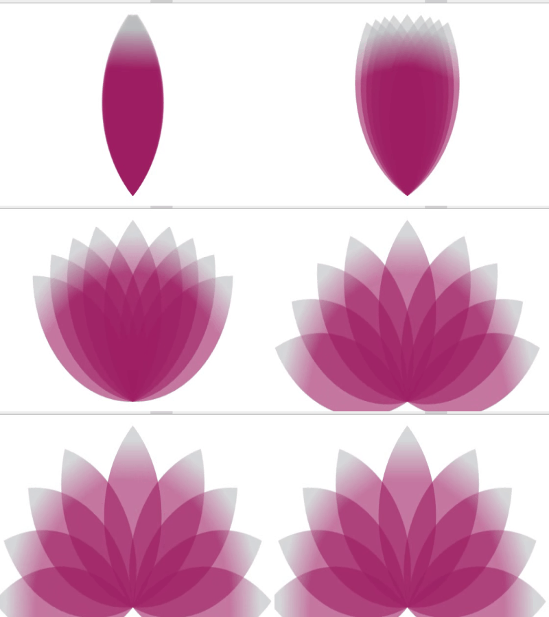
这效果看起来挺炫,但原理并不复杂,能实现一片花瓣动起来,就能实现9片花瓣。效果的叠加而已。
HTML:
CSS:
View Code
body {
   background-color: #000;
}

.demo {
   margin:0px auto;
   width: 500px;
}

.box {
   position: relative;
   height: 400px;
   margin-top:400px
}

.box .leaf {
   position: absolute;
}

.leaf {
   margin-top:0px;
   width: 200px;
   height: 200px;
   border-radius: 200px 0px;
   background: -moz-linear-gradient(45deg,rgba(188,190,192,1) 8%,rgba(158,31,99,1) 30%,rgba(158,31,99,1) 100%);
 background: -webkit-linear-gradient(45deg,rgba(188,190,192,1) 8%,rgba(158,31,99,1) 30%,rgba(158,31,99,1) 100%);
   opacity: .6;
   filter:alpha(opacity=50);
   transform: rotate(135deg);
   transform-origin:  top right;
}

@keyframes show-2 {
    0% {
     transform: rotate(135deg);
    }
    50% {
     transform: rotate(45deg);
    }
    100%{
     transform: rotate(135deg);
    }
}
@keyframes show-3 {
    0% {
     transform: rotate(135deg);
    }
    50% {
     transform: rotate(65deg);
    }
    100%{
     transform: rotate(135deg);
    }
}
@keyframes show-4 {
    0% {
     transform: rotate(135deg);
    }
    50% {
     transform: rotate(85deg);
    }
    100%{
     transform: rotate(135deg);
    }
}
@keyframes show-5 {
    0% {
     transform: rotate(135deg);
    }
    50% {
     transform: rotate(105deg);
    }
    100%{
     transform: rotate(135deg);
    }
}
@keyframes show-6 {
    0% {
     transform: rotate(135deg);
    }
    50% {
     transform: rotate(165deg);
    }
    100%{
     transform: rotate(135deg);
    }
}
@keyframes show-7 {
    0% {
     transform: rotate(135deg);
    }
    50% {
     transform: rotate(185deg);
    }
    100%{
     transform: rotate(135deg);
    }
}
@keyframes show-8 {
    0% {
     transform: rotate(135deg);
    }
    50% {
     transform: rotate(205deg);
    }
    100%{
     transform: rotate(135deg);
    }
}

@keyframes show-9 {
    0% {
     transform: rotate(135deg);
    }
    50% {
     transform: rotate(225deg);
    }
    100%{
     transform: rotate(135deg);
    }
}

.leaf:nth-child(1) {
 background: -moz-linear-gradient(45deg,rgba(250,250,250,1) 8%,rgba(158,31,99,1) 30%,rgba(158,31,99,1) 100%);
}
.leaf:nth-child(2) {
  animation: show-2 6s ease-in-out infinite;
}
.leaf:nth-child(3) {
  animation: show-3 6s ease-in-out infinite;
}
.leaf:nth-child(4) {
  animation: show-4 6s ease-in-out infinite;
}
.leaf:nth-child(5) {
  animation: show-5 6s ease-in-out infinite;
}
.leaf:nth-child(6) {
  animation: show-6 6s ease-in-out infinite;
}
.leaf:nth-child(7) {
  animation: show-7 6s ease-in-out infinite;
}
.leaf:nth-child(8) {
  animation: show-8 6s ease-in-out infinite;
}
.leaf:nth-child(9) {
  animation: show-9 6s ease-in-out infinite;
}
以上就是CSS3实现莲花绽放得动画效果的详细内容,更多关于CSS3 莲花绽放动画的资料请关注考高分网其它相关文章!



