


先看效果
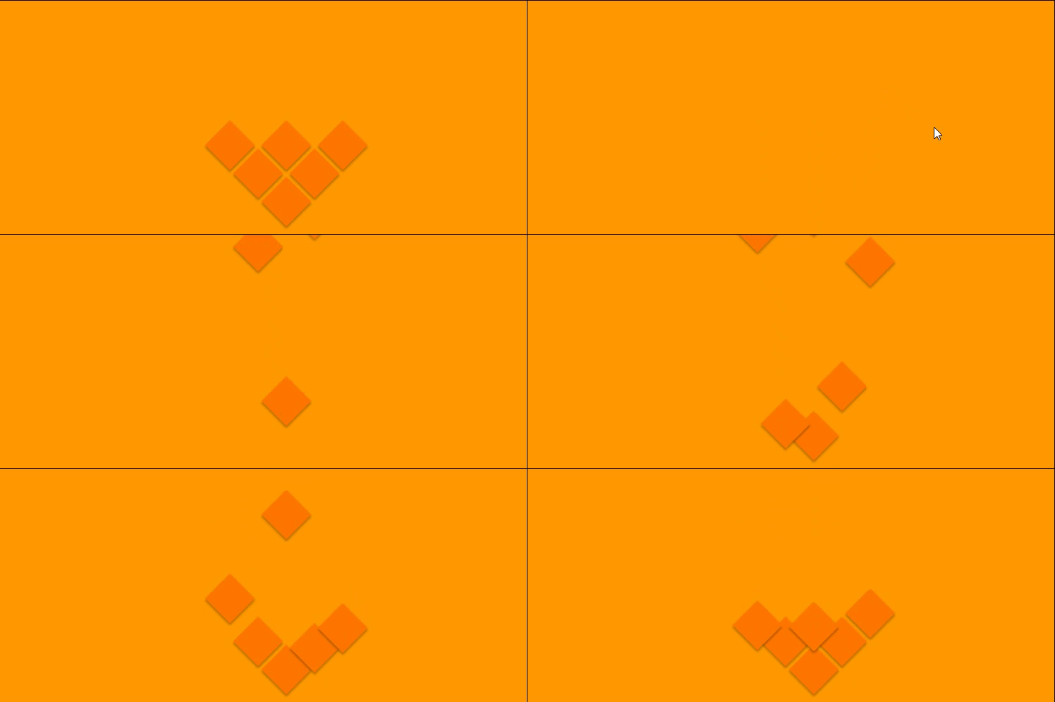
实现代码
* {
  margin: 0;
  padding: 0;
  box-sizing: border-box;
}
body {
  width: 100%;
  height: auto;
  background: #f90;
  overflow: hidden;
}
.box {
  width: 50px;
  height: 50px;
  background: #f70;
  transform: rotate(45deg);
  position: absolute;
  box-shadow: 2px 2px 3px rgba(0, 0, 0, 0.3);
}
.box1 {
  left: calc(50% - 25px);
  top: calc(100% - 75px);
  animation: box1 cubic-bezier(1, 0, 0.45, 1.4) 2s 1;
}
.box2 {
  left: calc(50% - 65px);
  top: calc(100% - 115px);
  animation: box2 cubic-bezier(1, 0, 0.45, 1.4) 2.5s 1;
}
.box3 {
  left: calc(50% + 15px);
  top: calc(100% - 115px);
  animation: box3 cubic-bezier(1, 0, 0.45, 1.4) 3s 1;
}
.box4 {
  left: calc(50% + 55px);
  top: calc(100% - 155px);
  animation: box4 cubic-bezier(1, 0, 0.45, 1.4) 3.5s 1;
}
.box5 {
  left: calc(50% - 105px);
  top: calc(100% - 155px);
  animation: box5 cubic-bezier(1, 0, 0.45, 1.4) 4s 1;
}
.box6 {
  left: calc(50% - 25px);
  top: calc(100% - 155px);
  animation: box6 cubic-bezier(1, 0, 0.45, 1.4) 4.5s 1;
}
@keyframes box1 {
  from {
    top: -100px;
  }
  to {
    top: calc(100% - 75px);
  }
}
@keyframes box2 {
  from {
    top: -100px;
  }
  to {
    top: calc(100% - 115px);
  }
}
@keyframes box3 {
  from {
    top: -100px;
  }
  to {
    top: calc(100% - 115px);
  }
}
@keyframes box4 {
  from {
    top: -100px;
  }
  to {
    top: calc(100% - 155px);
  }
}
@keyframes box5 {
  from {
    top: -100px;
  }
  to {
    top: calc(100% - 155px);
  }
}
@keyframes box6 {
  from {
    top: -100px;
  }
  to {
    top: calc(100% - 155px);
  }
}
以上就是CSS3 实现图形下落动画效果的详细内容,更多关于CSS3 图形下落的资料请关注考高分网其它相关文章!



